
An Introductory Guide for Artists
Recently someone in my community asked me how to choose a palette. The palette can really influence the aesthetics of your painting. Here are some of the most commonly used color palettes in different art genres.
Portrait Palette:
When it comes to portraiture, the artist’s palette takes on the responsibility of conveying the intricate nuances of human expression and emotion. A portrait palette often emphasizes flesh tones, capturing the diversity of skin hues, shadows, and highlights. Here are some key colors that I use often in portrait painting:
- Cadmium Red: Used for warm undertones on skin and rosy cheeks.
- Naples Yellow: You can use it as the base of many different skin tones.
- Yellow Ochre: It adds warmth to skin tones.
- Ultramarine Blue: Provides cool shadows and can be used in mixing with yellows and reds for subtle variations in skin tone.
- Burnt Sienna or Raw Umber: creating darker and tanner skin tones, and shadows.
- Titanium White: Essential for highlighting and achieving light values. Tip: Don’t use it alone, the highlights you see on a person’s nose tips or check bones in portrait paintings are usually not pure white, but mixed with Naples yellow, or similar colors.
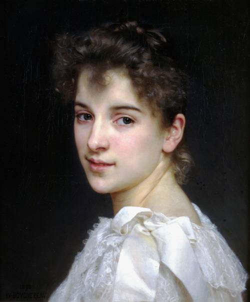
Bouguereau is famous for his life-like portraits:
Plein Air Palette:
Plein air painting means painting outdoors in nature.
Some popular plein air palette includes:
- Viridian: Ideal for capturing lush greens in landscapes.
- Cerulean Blue: A must-have for painting the sky.
- Sap Green: Not as saturated as viridian, so it’s perfect for foliage and natural elements.
- Yellow Ochre: Adds warmth to earthy tones and captures the glow of sunlight.
- Cadmium Yellow: Capture sunlight that bounces off everything in nature.
- Burnt Sienna: Useful for earthy tones and capturing the essence of trees and rocks.
- Raw Umber: Cooler than Burnt Sienna. Another must-have to paint earth and shadows in nature. When you add a little Raw Umber with Blues, you will get the darks that are close to black but not totally black, so it looks more natural.
- Cadmium Red: You can use it to mix with blues to make purple shadows, instead of using purple. I found it more natural looking when I mix them.
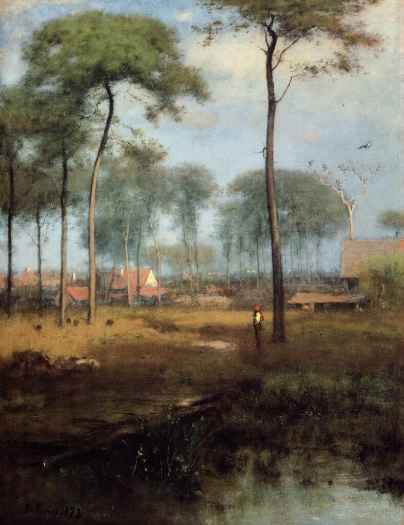
landscape painter George Inness loved to paint the beauty of 19th-century American landscapes.
Still Life Palette:
Still, life is a great practice to improve your painting skills. When I was in art school, my teacher first taught me how to paint cups, glasses vases, and all kinds of common household items. It’s a great way to learn forms, edges, compositions, and all those important fundamentals in painting.
A still-life palette is often a delicate balance of soft hues and muted tones, to bring out the peace and calm in our environment. Key colors to consider for a still-life palette include:
- Ivory Black: Provides depth and creates shadows and darker areas.
- Burnt Umber: Useful for earthy tones and capturing the texture of objects.
- Cadmium Yellow: Adds a vibrant touch to flowers, fruits, or other focal points.
- Rose Madder: Offers a soft, delicate touch for floral arrangements.
- Soft Grays and Pastels: Perfect for creating serene and contemplative atmospheres.
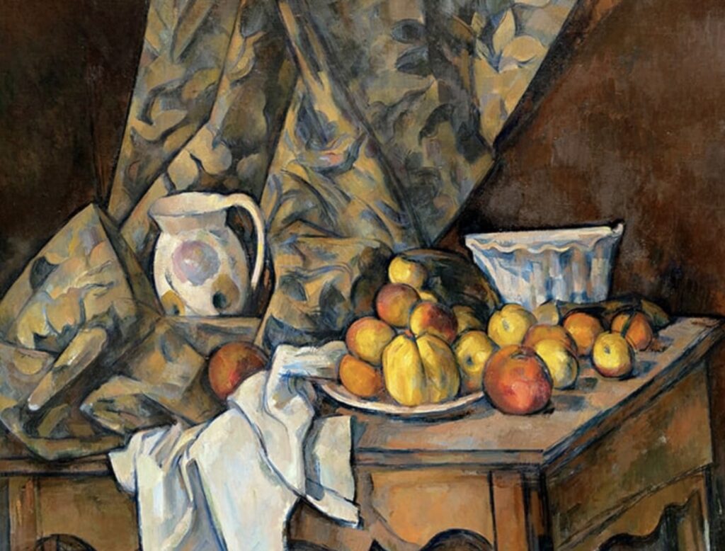
Paul Cézanne set the ground for the emergence of modern art movements with his inventive still-life and landscape paintings.
Those are some of my favorite palettes. Of course, there are many, many different color combinations. When you paint paint a lot, you will find your personal favorite color palette.
If you have any questions about painting and art business in general, just comment on this post and I will make sure to get back to you!
Cheering you on!
Ying
Pingback: Color Theory Guide: A Comprehensive Guide for Artists - Ying McLane