
I used to live in a city which rains all the time. I often will feel depressed just by getting up in the morning, seeing the grayish sky, and knowing it’s another rainy day.
Now I am blessed to live in the sunshine state of Florida and I love to open my eyes in the morning and see the blue sky and lush greeneries. It’s hard for anyone to be in a bad mood in a bright and colorful environment!
You see, our world is consisted of colors. Color has a profound impact on our everyday life.
And artists have the undeniable power to use colors to make an impact.
That’s why understanding color theory is essential for artists who want to take their art to the next level.
In this blog post, we will explore the fundamentals of color theory and use plenty of examples of how artists can use it to enhance their paintings.
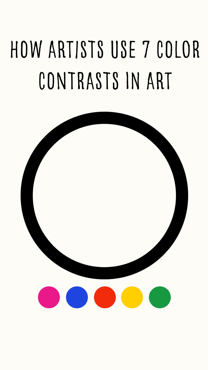
The Basics of Color Theory
Color theory is the study of how colors interact with each other and how they can be combined to create visually appealing compositions. It is a fundamental concept in art and design, and it plays a crucial role in various art forms.
The Color Wheel:
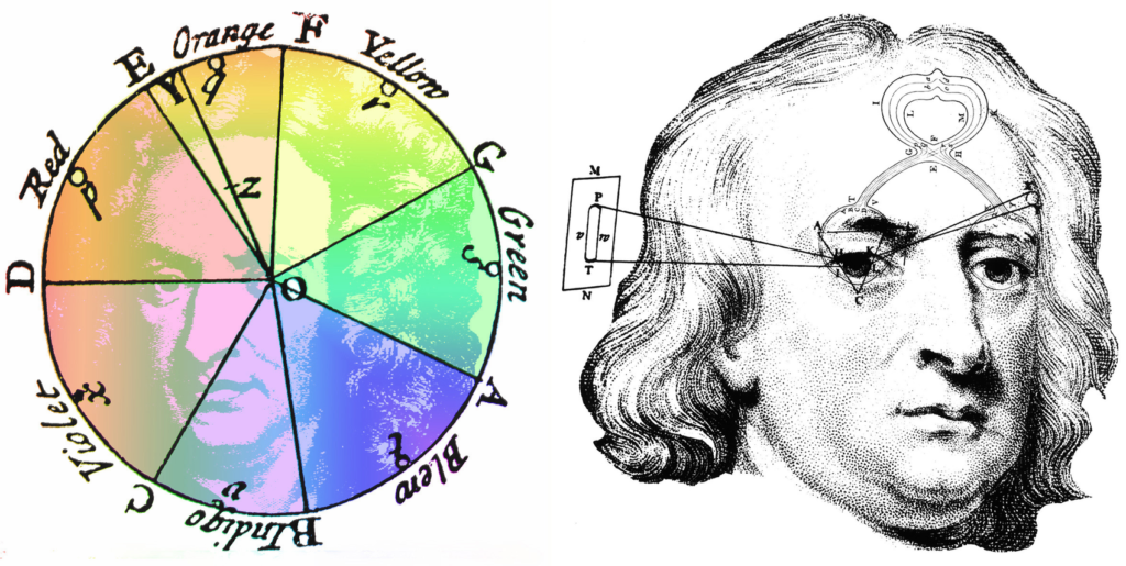
It’s a fundamental tool in color theory and has a rich history dating back to the 17th century. Sir Isaac Newton, the renowned physicist, is often credited with the invention of the first color wheel. He arranged colors in a circular chart to demonstrate how white light could be split into its component colors using a prism. This laid the foundation for understanding color relationships.
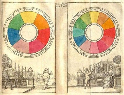
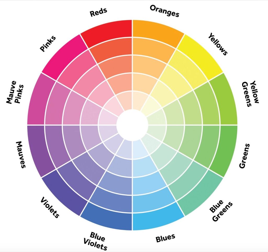
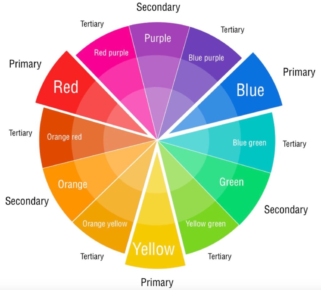
The color wheel is a circular chart that organizes colors in a systematic way.
It consists of primary colors (red, blue, and yellow),
Secondary colors(green, orange, and purple),
Tertiary colors(colors created by mixing a primary and a secondary color).
The color wheel helps artists understand how colors relate to each other and how they can be harmoniously combined.
There are three aspects of color:
Hue: means the specific color itself. Like red, orange red, etc.
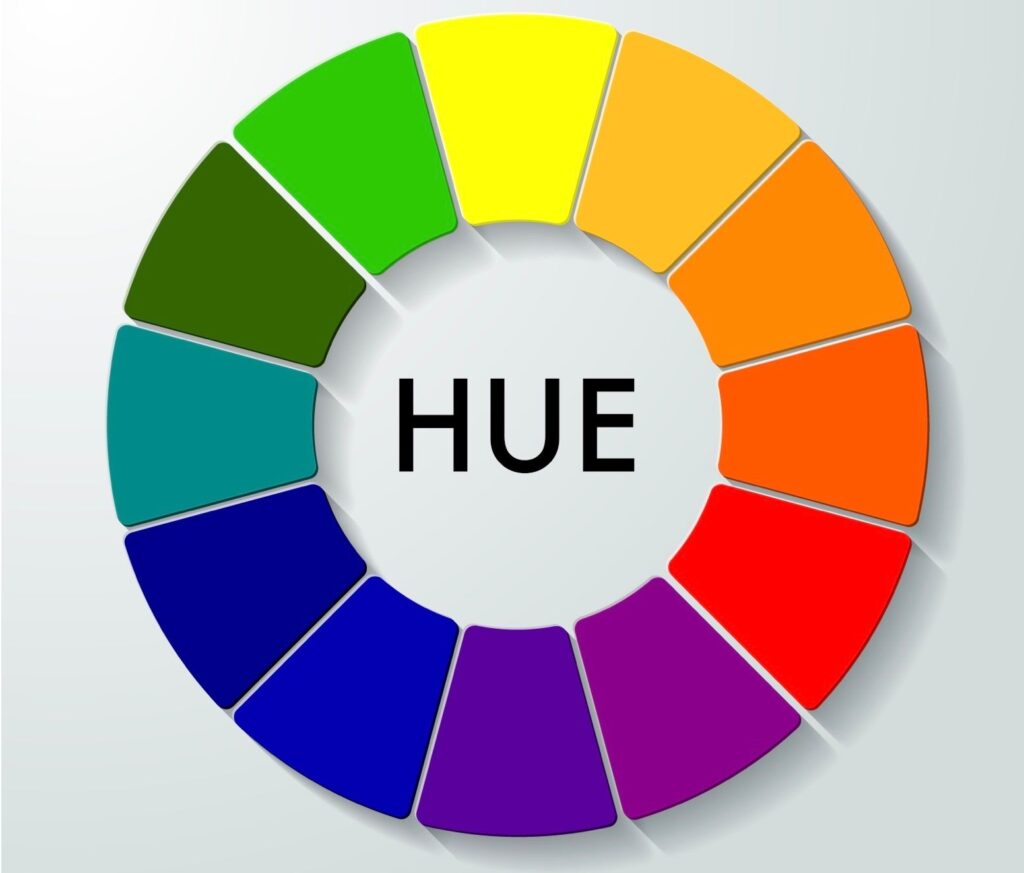
Value: the lightness or darkness or a color

Chroma: also called saturation, intensity. Means the brightness or dullness of a color.

Color Relationships:
Artists often use color relationships to create harmony or contrast in their paintings.
Some common color relationships include:
complementary colors:
The opposite colors on the color wheel.
Van Gogh liked to use bold, complementary colors in many of his paintings. In this painting, he used complementary blue and oranges, yellow and purple to express the warmth of the cafe in contrast with the starry night he was so fond of painting.
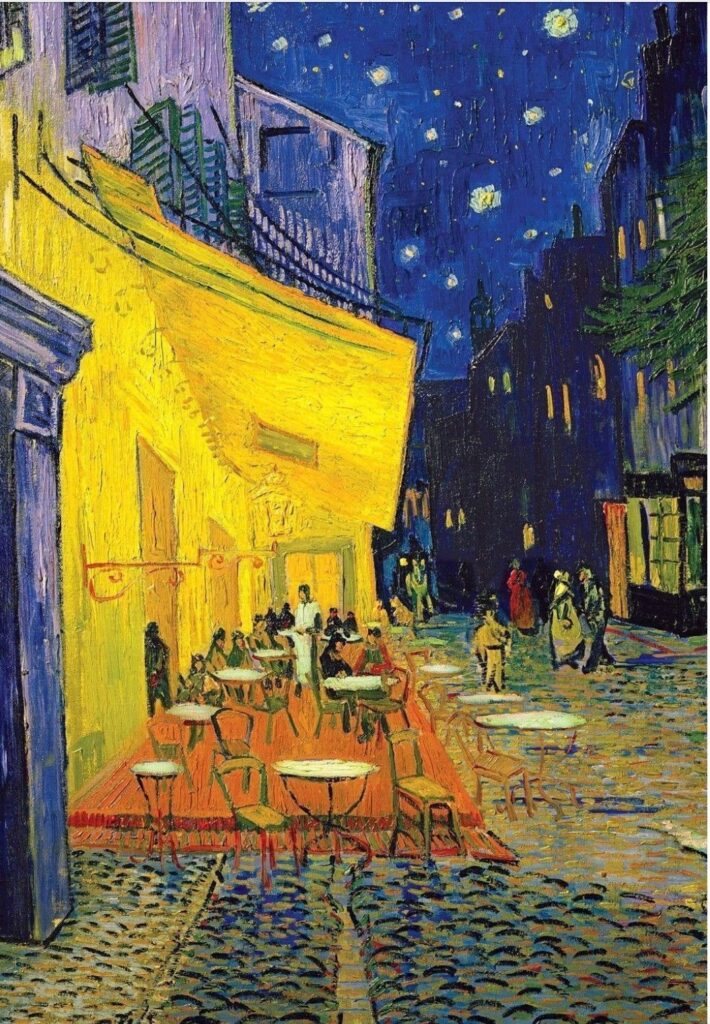
Cafe Terrace at night, Van Gogh
Analogous colors:
Colors that are adjacent to each other on the color wheel.
Picasso’s famous painting: “The Old Guitarist”, showcased his love for dark, moody analogous colors during his Blue period.
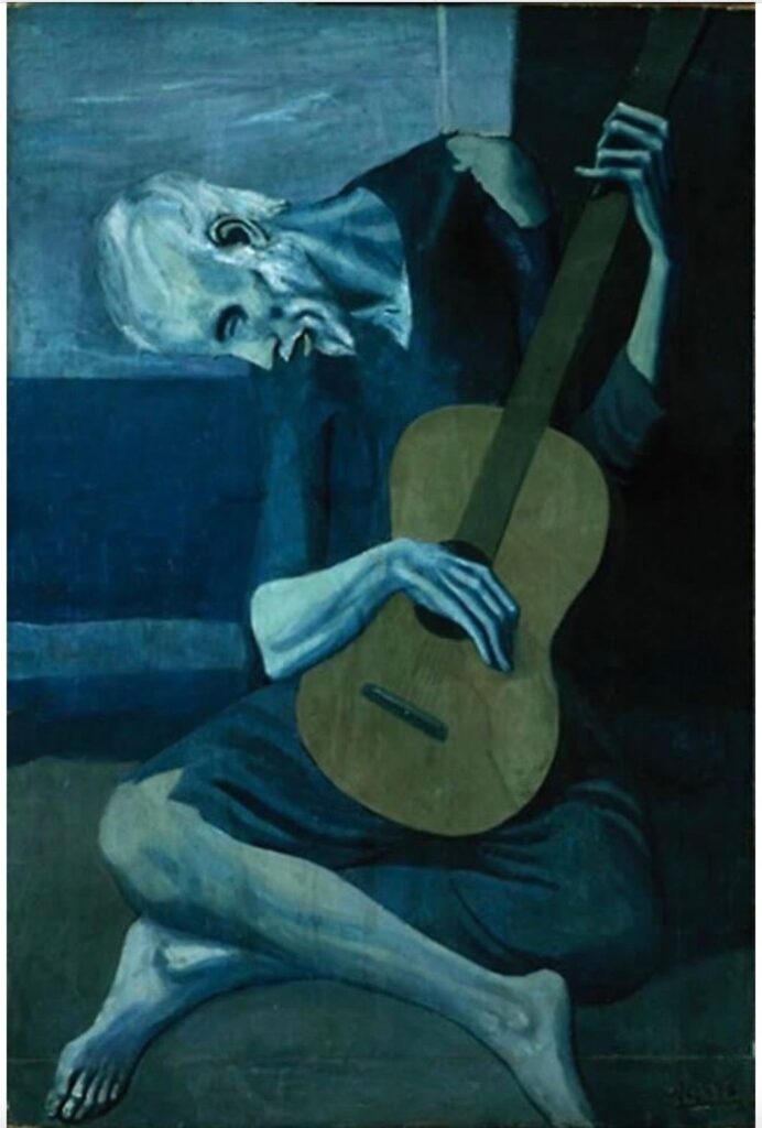
The Old Guitarist, Picasso
Monochromic colors:
A color scheme using only one color with different variations in value, hue, or chroma.
American landscape painter George Inness used the family of green colors in different variations to describe this serene and mystic scenery.
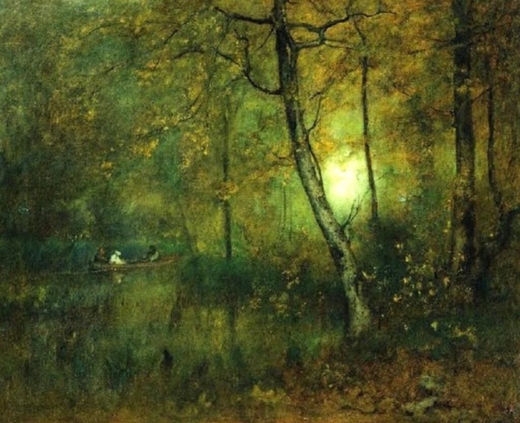
Pool in the Woods, 1892, George Inness
How to Use Color Theory in Paintings
Now that we’ve covered the basics of color theory and the history of the color wheel, let’s explore how artists can apply these concepts to their paintings:
1: Setting the Mood: Different colors evoke different emotions. Understanding the historical associations of colors can be particularly valuable.
For example, red has long symbolized passion and love, while blue has been associated with calm and tranquility.
Artists can use color to set the mood of their artwork and convey the intended emotions to the viewer.
Being one of the most famous Impressionist painters, Monet is a master in using colors creating dreamy, peaceful art.
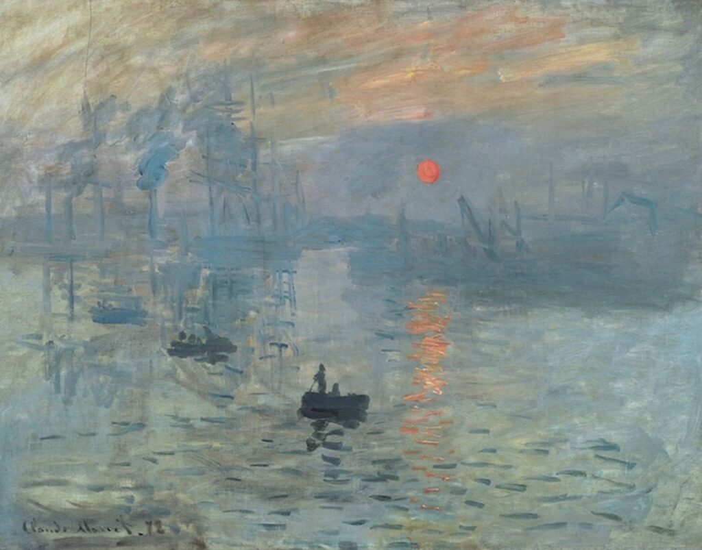
Impression Sunrise by Claude Monet
2: Creating Focal Points: The historical use of complementary colors to create contrast and draw attention to specific areas of a painting is a time-tested technique. It helps create focal points that guide the viewer’s eye and emphasize important elements within the composition.
Sargent used red and skillfully placed the focal points of this painting.
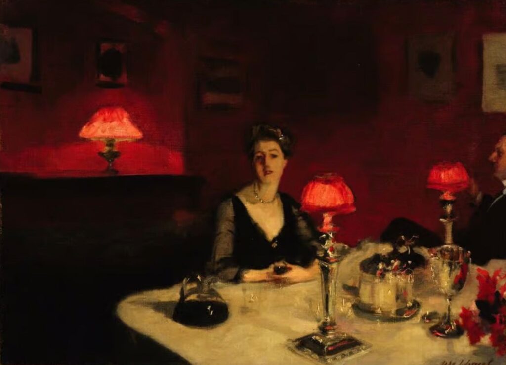
A dinner table at night by John Singer Sargent
3: Achieving Balance: Historical artists like Johannes Itten and Josef Albers, who were influential in the field of color theory, emphasized the importance of balance and harmony in artworks.
Josef Albers’s famous modern art series: Homage to the Square used color relationships like complementary or analogous colors, and achieved a sense of balance that makes the artwork visually pleasing and engaging to the viewer.
Homage to the Square, Josef Albers
4: Adding Depth and Dimension: Manipulating the values of colors allows artists to create depth and dimension in their paintings.
The historical use of chiaroscuro, a technique that uses strong contrasts between light and dark, is an example of how artists have harnessed the power of value to create three-dimensional effects.
When it comes to the chiaroscuro technique, Italian painter Caravaggio is the first to come to mind:
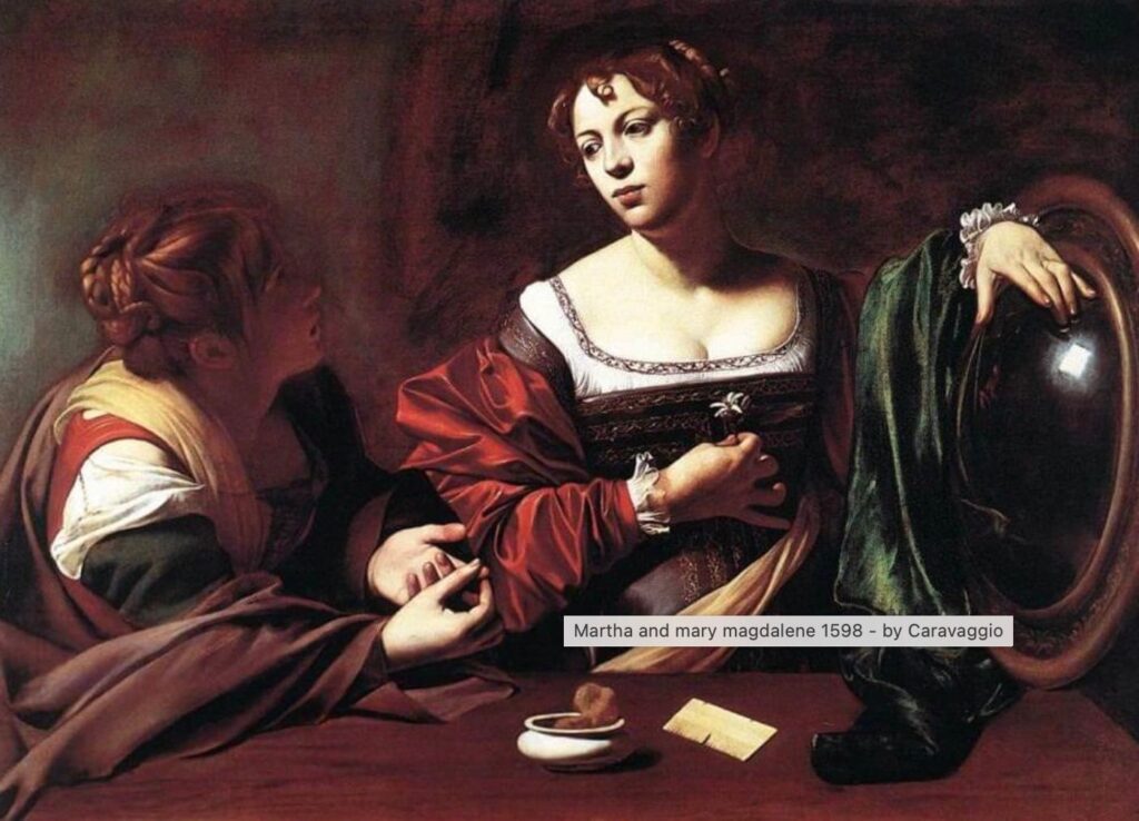
Martha and Mary Magdalene 1598 – by Caravaggio
5: Conveying Symbolism: Colors are often associated with symbolism. For example, red may symbolize passion and love, while green may symbolize growth and renewal. Artists can use these color-symbolism associations to convey deeper meanings and messages in their artwork.
Take another painting by Caravaggio, the red in the boy’s cloth symbolizes the energy and vibrancy of youth.
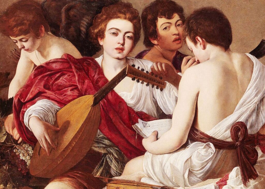
The Musicians or Concert of Youths (c. 1595) by Caravaggio
Limitations of the Color Wheel
First, the color wheel does not include the impact of white and black.
When you add white to a color, you will make it lighter hence increasing the value of that color.
When you add black to a color, you will make it darker hence decreasing the value of a color.
Both white and black will decrease the chroma/saturation of a color.
Second, In reality, there are few colors you can’t mix to exactly match the color wheel.
Artist tip: For example, purple is a hard color to mix. Our artist member Linda pointed out to me that Quinacridone magenta and ultramarine make an absolutely gorgeous purple, Thank you Linda!
To learn the basics of choosing a color palette for painting, check out this guide: https://yingmclane.com/how-artist-choose-palette/
Master color schemes can take your art to the next level, so don’t be afraid to experiment with color and discover the endless possibilities it offers in the world of art.
Hope this post is helpful.
Free to share and comment!

Pingback: Three rules in the art of oil painting - Ying McLane
Pingback: Oil or Acrylic Paint? Guide To Help You Choose Your Painting Medium - Ying McLane
Pingback: Oil or Acrylic Paint? Guide To Help You Choose Your Painting Medium 2 - Ying McLane
Ying, I read your comment on purple. Quinacridone magenta and ultramarine make an absolutely gorgeous purple.
Yes I just tested it and it works. Thanks for the tip. I will update my post!