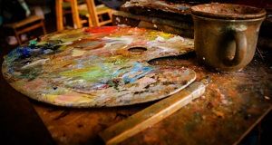
The artist’s palette is not just a mixing surface; it’s a tool that aids in translating imagination into tangible form. A palette should foremost be practical and well-organized.
In this chapter, we will cover the topics from the basics of preparing the palette to the intriguing realms of classic and limited palettes, and the unique charm of the Zorn palette.
3: Classic Palette vs Limited Palette
1: Preparing Your Palette:
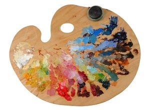
Wooden palettes are classic, while paper disposable palettes offer convenience; you can tear them off right after a painting session. You can also use a piece of glass as your palette. Glass palettes are easy to clean and allow for smooth color mixing.
If you choose to use a wooden palette, rub it with multiple coats of Linseed oil to protect the surface from paints.
Remember, the palette you choose has to be large enough to allow you to lay down all the paints and leave plenty of room for mixing colors.
I have all of these palettes in my studio. I use my glass palette most often. But when I want to do a quick underpainting with acrylics, I choose the disposable paper palette because acrylics dry quickly, and it’s hard to scrape off the wooden or glass palette as oil paints do.
Below is the link to the paper palette I use. I like how it was made of neutral grey paper to make judging color value easier: https://amzn.to/3uC3dxI
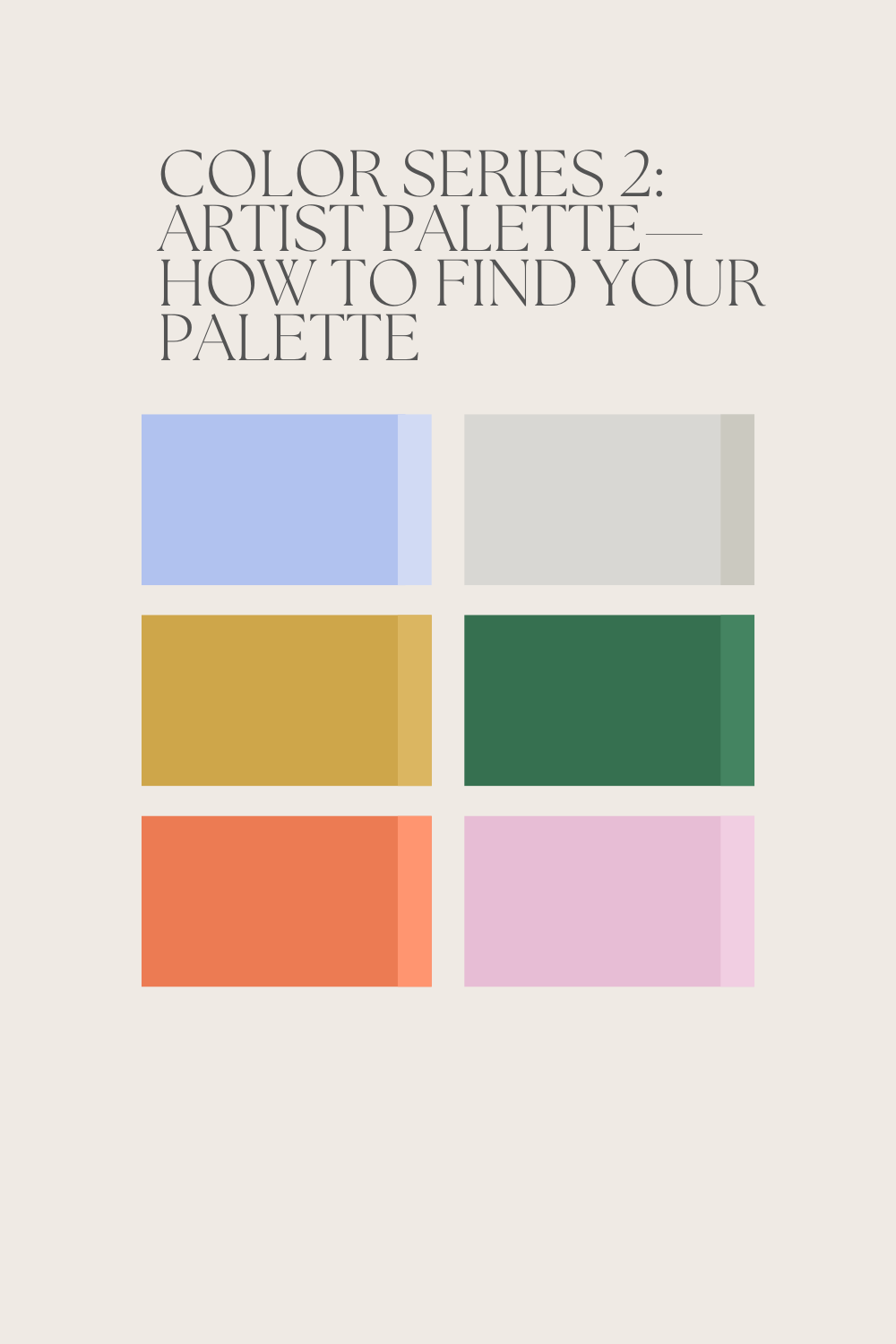
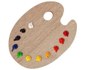
2. Organize Your Colors:
Arrange your colors in a logical order. There are many ways to organize your colors.
a: You can arrange them from light to dark, or dark to light.
b: You can group all the reds, yellows, blues, and browns together.
c: You can separate the bright colors from earth colors.
d: You can pre-mix the colors. You will mix each pure color with white or other colors to make tonal graduations. This method is especially useful in portrait paintings. As the skin color has many subtle graduations. So if you pre-mix the colors, you will save time in mixing the color as you paint.
3: Classic Palette vs Limited Palette
Classic Palette:
The classic palette is a broad spectrum of colors that includes primary and secondary colors. It provides a wide range for color mixing and is a staple for artists exploring various subjects and styles. The classic palette typically includes:
- Primary Colors:
- Red
- Blue
- Yellow
- Secondary Colors:
- Green (mix of blue and yellow)
- Orange (mix of red and yellow)
- Purple (mix of red and blue)
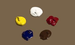
A recommended basic Classical palette includes:
Titanium White
Cadmium Yellow Light
Cadmium Red Medium
Cadmium Orange
Alizarin Crimson
Ultramarine Blue
Yellow Ocher
Raw Umber
Burnt Umber
Burnt Sienna
Ivory Black
Some of the additional paints I will add to my palette, depending on the painting I am working on, include:
Lemon yellow
Naples yellow (especially for portrait)
Cobalt blue
Prussian blue (especially for seascapes)
Phthalo blue (especially for seascapes)
Viridian green
Limited Palette:
In contrast, a limited palette restricts the number of colors used, fostering a more harmonious and cohesive look in a painting.
Limited palettes have been commonly used in grisailles, underpainting, and tonal paintings.
Grisailles are made using only black and white to achieve a grayscale effect. You can also add umbers like Burnt Sienna to add more warmth.
A good practice to understand the warm and cool color temperature/relationship is using only red, yellow, blue, and white.
Common limited palettes include:
a: Burnt Umber, Yellow Ochre, Ivory Black, Titanium White
b: Burnt Sienna, Yellow Ochre, Ultramarine Blue, Titanium White
c: Cadmium Red Medium, Cadmium Yellow Light, Cobalt Blue
d: A cooler palette: Cerulean Blue, Alizarin Crimson, Lemon Yellow, Titanium White
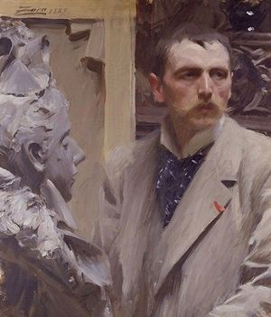
Zorn Palette:
Named after the Swedish artist Anders Zorn, the Zorn palette is revered for its ability to capture a wide range of colors with just four pigments:
- Ivory Black
- Titanium White
- Cadmium Red
- Yellow Ochre
- The Zorn palette is particularly effective for portrait painting, creating a warm, muted color scheme with a distinct Old Masters feel.
Note: Expect the colors with the same name from different manufacturers to sometimes have slight and sometimes great variations. Try different brands and pay attention to the differences. And it’s absolutely ok to mix colors from different brands.
4: Find Your Own Palette
When it comes to choosing your own best palette, don’t stress out. The rule of thumb is, if you’re just starting, stick with a simple, classic palette—it’s your best bet.
The best way to find a color arrangement that suits your needs is to just start painting. With time, you will find your working rhythm, and your color palette will follow.
But I encourage you to at least try the limited palette in your spare time. You will learn so much about color mixing, color temperature, and hues from the limited palette.
5: Simple Exercise
Paint a simple still life or abstract painting using different combinations of a limited color palette. So you can better understand color temperature, interactions, and relationships.
A: Paint a grisaille—use only black and white.
B: Add umbers like Burnt Sienna to it.
C: Now add a blue like ultramarine blue to see the warm/cool relationships.
D: Using only red, yellow, blue, and white to paint the same object.
Check out this post for some interesting color history: https://yingmclane.com/the-interesting-history-of-artists-color/
If you enjoyed this post, share it with a friend or leave a comment.