When a painting uses a diagonal design, it usually creates an interesting and dramatic effect that keeps the viewer’s eyes engaged with the artwork, regardless of the subject.
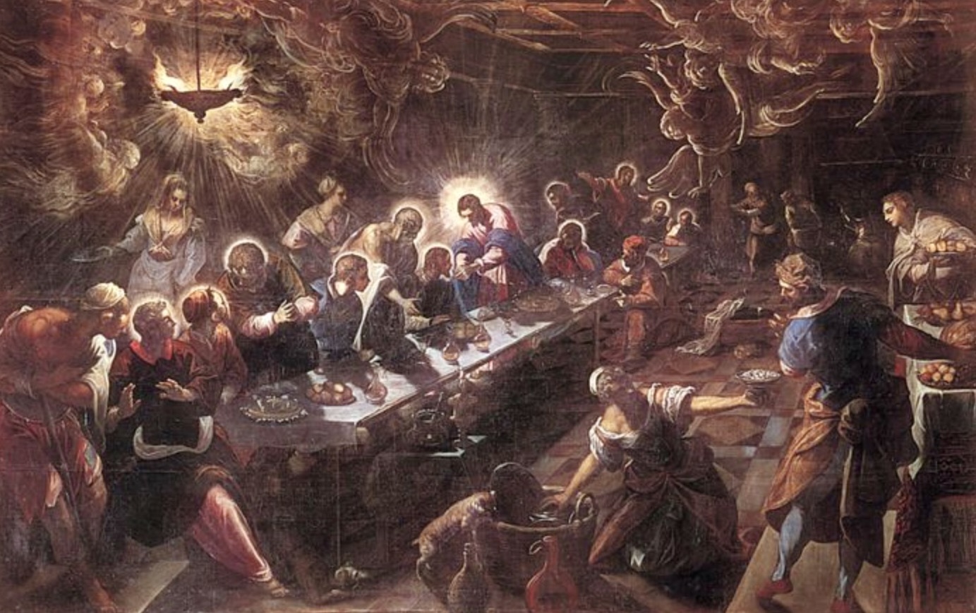
Unlike the solemn, balanced composition in Leonardo da Vinci’s “The Last Supper,” his contemporary Jacopo Tintoretto’s version of “The Last Supper” is much more dynamic and full of movement.
The diagonally arranged long table sets the motion in the painting, with everything pointing to Jesus, who is in the middle of the table with a halo around his head. You can almost feel the chaotic air in the scene—with the woman kneeling in the foreground bringing out the food, the cat trying to steal from the basket, and the apostles chatting lively with each other, all signifying this is an important event in history.
The woman and the apostles all face Jesus, drawing the focus to him. Jesus acts as the link between the mundane life depicted in the lower half of the painting and the spiritual realm signified in the upper half.

The diagonal design also applies to portraits.
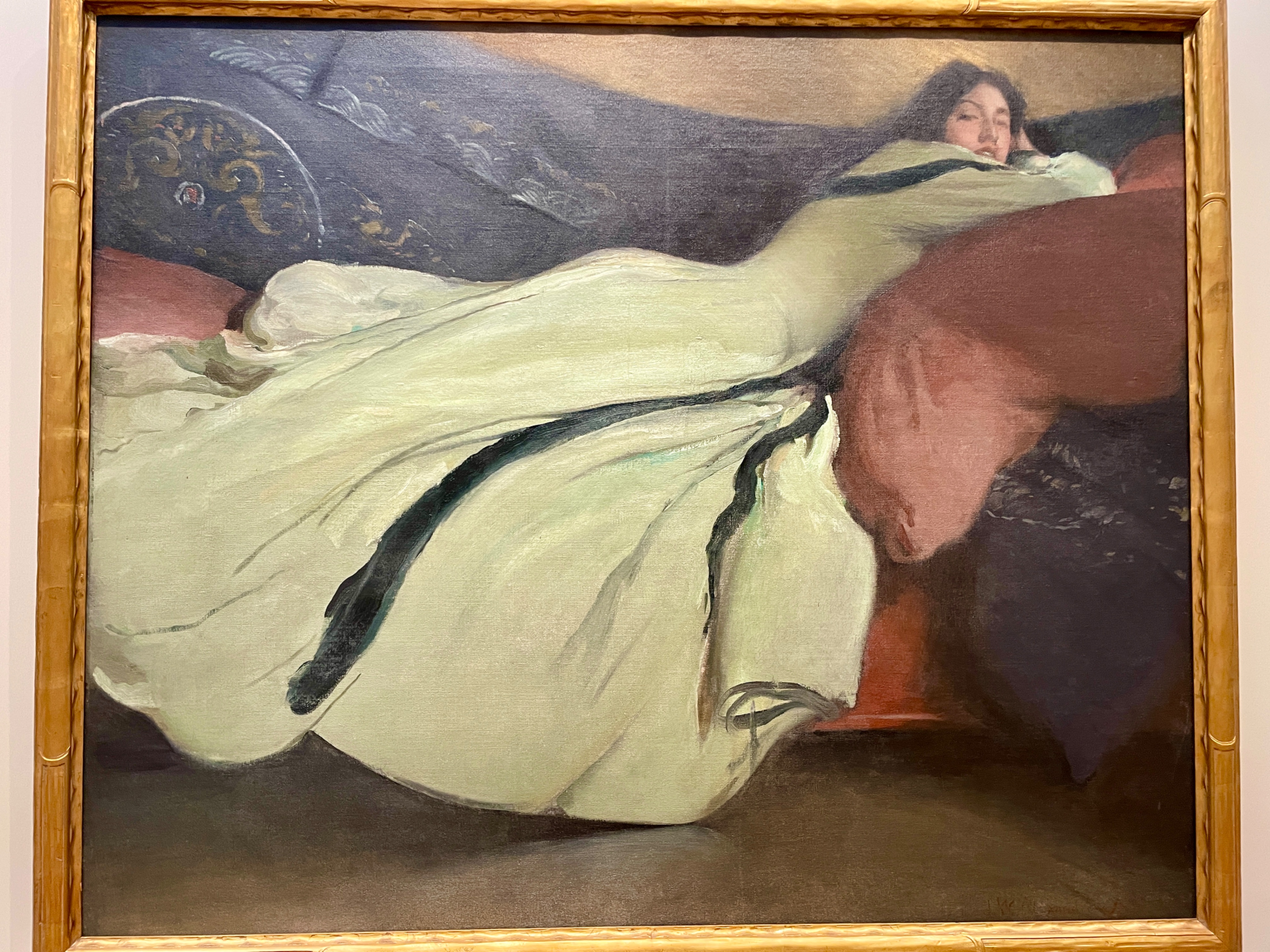
In John White Alexander’s portrait of a famous American dancer of her time, the dancer’s long white dress occupies most of the center space in a diagonal line.

The artist may have gotten his composition inspired by the fact the dancer was renowned for manipulating the swirling folds of her silk dress during her performances.
This unconventional composition for a portrait left a lasting impression on me when I visited the Met.
For more composition tips in art, please see my previous post here: https://yingmclane.com/sturdy-triangular/
I hope you enjoyed this post. Please leave a comment or share with a friend.


