Order, harmony, rational, and peace are often the first words that jump out at us when we see a painting designed with symmetry. No wonder in religious art we often see paintings designed with symmetry to represent God’s order, beauty, and harmony in creation.
In fact, in the 15th century, architect and theoretician Leon Battista Alberti first introduced the concept of composition in painting in his book “On Painting”. He used the term “composition” to describe the use of mathematics and geometry to create harmonious and beautiful paintings that illuminate God’s creations.
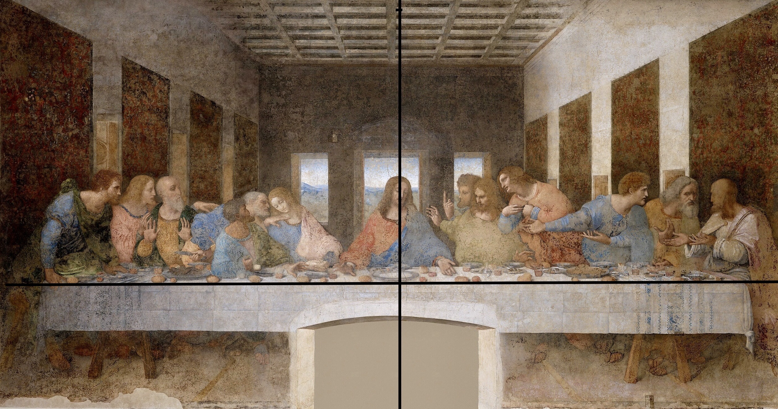
In Da Vinci’s famous mural painting—The Last Supper, the composition pivots around a central vertical axis that runs through Jesus.
The 12 disciples are separated into 4 groups of three, and equally placed on either side of Jesus, even their clothing colors— red, blue, and green are equally placed on both sides, giving equal weight to both sides of the painting–just like a pair of scales.
The painting demonstrates Leonardo’s masterful use of perspective as it draws our attention to the face of Christ at the center of the composition.
However, perfect symmetry could seem boring or static. Even our faces are not exactly symmetrical between the left and right portions.
Thus, an asymmetrical composition is more dynamic compared to symmetry. But it indeed requires more careful planning and balancing, or you will have an awkward or weird piece of art.
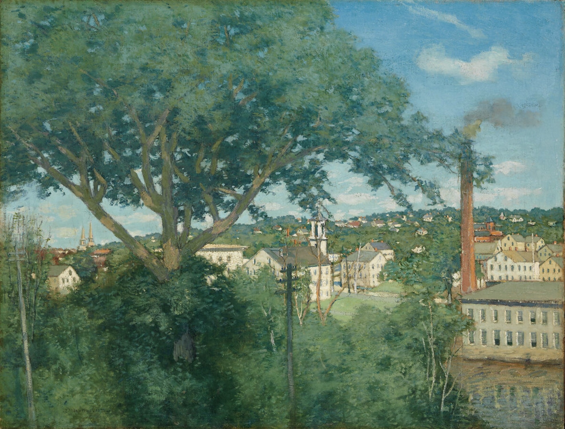
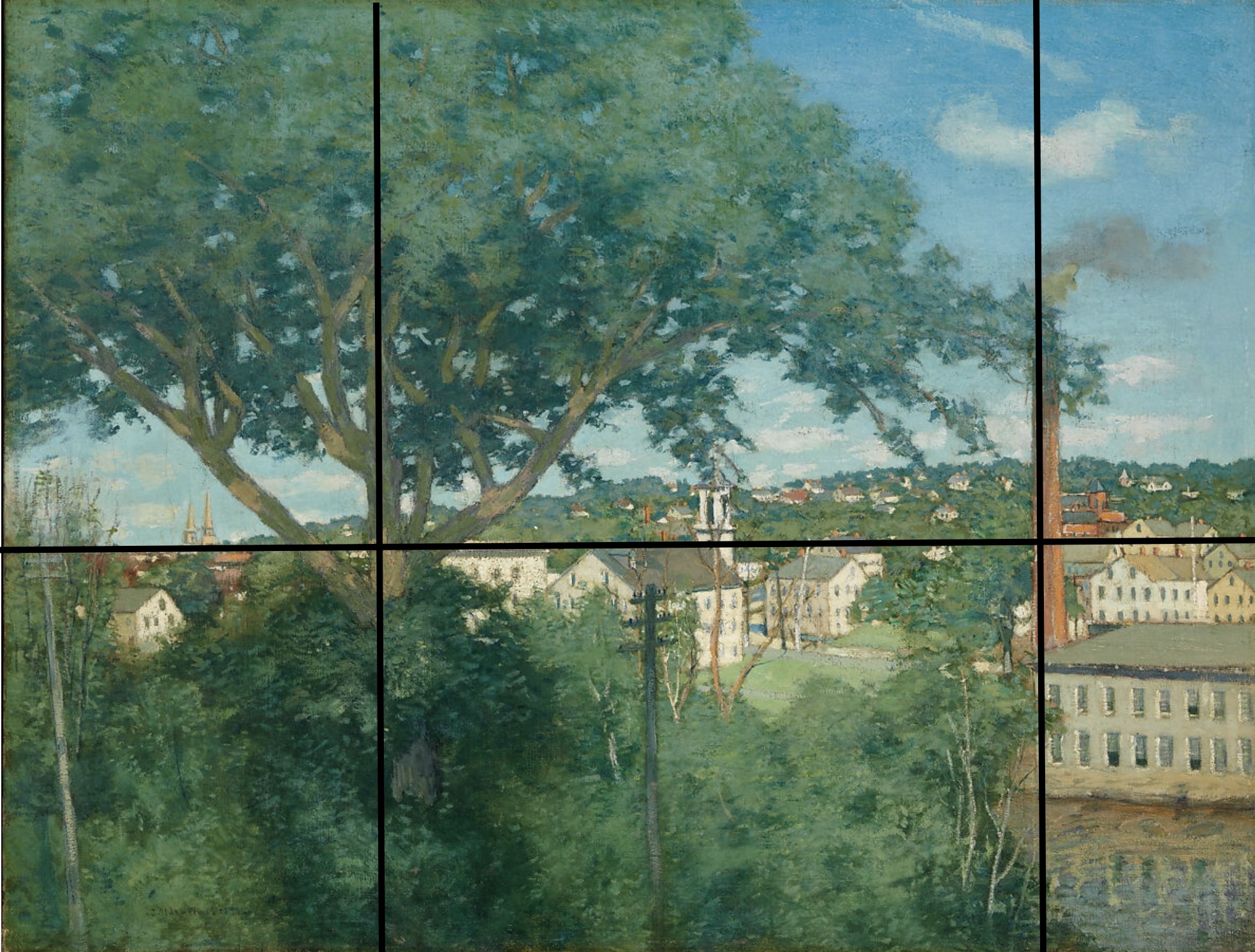
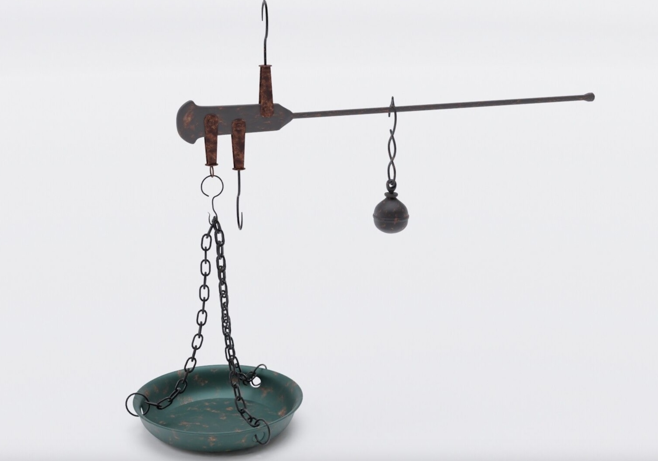
In this 1897 painting of the Willimantic Linen Company and its surrounding village, outside of Hartford, Connecticut, a large tree spreads its canopy over telegraph poles and the factory, taking the center point. The chimney on the right acts as a fulcrum, a balancing point or anchor to the mass of the tree. This arrangement has a similar principle to a steelyard—the big object is balanced by a smaller one.
I hope this post helps you clearly see the difference between symmetrical and asymmetrical composition in art. Leave a comment or share with a friend!



What you’ve crafted here is not merely an article, an essay, or a blog post. It’s an experience. Every sentence is like a brushstroke, creating a picture that the reader gets to step into. It’s the kind of writing that leaves you feeling as though you’ve lived through something beautiful, something transformative.