I’ve always found the history of artist’s color is very intriguing. And color can actually make or break a painting.
So today we are starting an exciting new art series— the artist’s color. In this first post we will briefly cover:
1: Artist’s color and emotions
What color do you like? Intense, saturated, bold? Or calming, soothing, not showy, and nuanced?
Do you know colors have a remarkable ability to influence our emotions and perceptions, creating a unique language that goes beyond words?
Like blue is a color that resonates with a sense of tranquility and calmness. It has the power to evoke feelings of peace and serenity. It is also associated with authority and professionalism, often seen in corporate settings.

In contrast, red is a color that commands attention and stimulates the senses. It is often linked to strong emotions such as passion and love. The intensity of red can elicit a wide spectrum of feelings, from warmth and excitement to caution and urgency.

Color is an essential part of an artist’s self-expression. It’s rooted deeply in human psychology and emotions since the dawn of time.
2: Color and materials
The earliest cave art used clays, carbon, chalk, the materials we still use to mix color today.

Black colors were made from burnt wood, bone, or other organic materials. White was made from chalk, pale clays, or ground bone or shells.
Colored clays dug up from the stream beds have many shades of browns and reds. Once earthed or burned, you get a beautiful range of colors.
Like Burnt Sienna, which is reddish clay going through a burnt process to produce a more reddish color than Raw Sienna. The same applies to Burnt Umber and Raw Umber. Hence comes the name of the most popular color palette: the earth tone. Even today’s earth palette is still mostly made from the same materials.
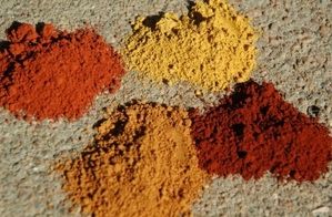
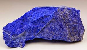
During the medieval world and Renaissance, artists started using ground gemstones like lapis lazuli; those colors were very expensive and only reserved for special paintings.
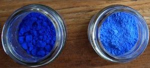
On the material aspect, besides earth colors, egg tempera, which uses egg as a medium, became very popular in making art. In painting, artists often use it as glazes.
3: Artist’s Color as symbols
Throughout history, colors have played a crucial role in religious art and architecture.
From celestial blues adorning cathedral ceilings to the rich reds symbolizing sacrifice, the use of color in sacred contexts goes beyond aesthetics—it communicates narratives, conveys emotions, and links individuals to profound spiritual meanings.
In the time of Greeks and the Roman Empire, colors were associated with a certain social class or their gods and legends.
In Christian art, blue becomes a vessel for representing the Virgin Mary, symbolizing her purity and celestial connection. The deep azure hues found in stained glass windows and Renaissance paintings create an ethereal atmosphere, inviting contemplation and a sense of the sacred.
Botticellie painted many beaituful Virgin Mary paintings and most of them have Mary dressed in blue robe as to represent royalty and purity.
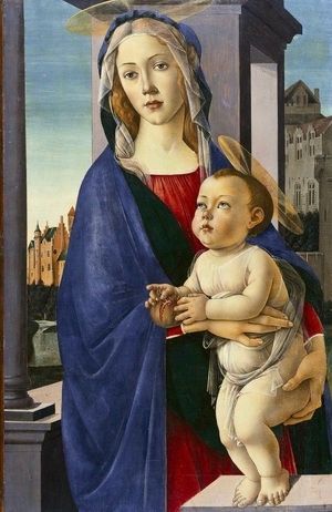
The Virgin and child, Sandro Botticelli, 1490
while red It becomes a poignant reminder of Christ’s sacrifice, symbolizing the blood shed for the salvation of humanity.

Christ weeping over Jerusalem, Ary Scheffer, 1851
4: The science of artist’s color
On the scientific front, Sir Isaac Newton first published the modern color theory in 1672 —the primary and secondary colors represented as a color wheel. We will dive in details about color wheel later.
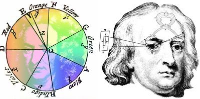
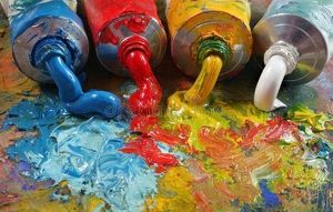
And by the eighteenth century, the invention of color in tubes totally changed the game. Before that, artists had to learn the art of grinding and mixing colors, which was a labor-intensive task and made it almost impossible to paint outdoors.
The Industrial Revolution and the invention of tube colors greatly expanded the colors artists could use, like Cadmiums, Alizarin, Phthalos.
And the flourishing of art supply stores increased the quantity available on the market and lowered the paint cost.
Before that, artists used to have to make their own paints—a craft taught from one generation of painters in their studios to the next.
But color manufactories, like Winsor & Newton (founded in 1832) in England and Sennelier in France (founded in 1887), took the labor of making paints from the artist’s hands.
5: Color systems in art
In 20th century, painter and teacher at the Massachusetts College of Art,Albert Munsell, developed the concepts of hue, value, and chroma. It became known in the world as the Munsell Color System, which we will explore in detail in this course later.
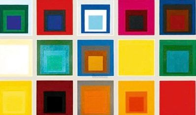
We also have to note another influential modern artist: Josef Albers. His exploration of the endless and poetic color organizations inspired numerous artists after him. His most famous series, Homage to the Square, expressed innumerable subtle interactions in hues, values, and chromes of colors.
Next we will talk about how to choose artist palette. Stay tuned!
If you like to learn use the right brushstrokes to paint transparent color, check out this blog here: https://yingmclane.com/how-transparent-colors-elevate-your-painting/.
Also, this is an interesting article about color combinations: https://colorhunt.co



Pingback: Color Series 2: Artist Palette—How to Find Your Palette - Ying McLane
Very interesting, Ying! I’ll go on to read your posts now. . . Thanks for much for sharing all your art knowledge and expertise with all of us! 👏👍❤️
Very interesting, Ying! I’ll go on to read your posts now. . . Thanks for much for sharing all your art knowledge and expertise with all of us! 👏👍❤️