
Picasso once said, “Colors, like features, follow the change of the emotions.” The best art pieces evoke human emotions and stimulate psychological reactions.
We are all familiar with how Van Gogh used bright and complementary colors to express his intense emotions, and how Rembrandt used sober earth tones to depict the emotions in his portraits.
Due to the importance of color schemes, I am going to present this topic in several parts, providing you with details and examples of different color schemes. After reading these, you will never look at a piece of art in the same way again!
3: The Split Complementary Color Scheme
1: Complementary Color Scheme
The most popular color scheme used in contemporary art involves using one main color and its complementary color on the color wheel.
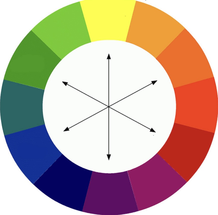
Complementary colors are those that are opposite each other on the color wheel. The main color serves as the dominant color, while the complementary color acts as an accent. This color scheme is widely used in all forms of art.
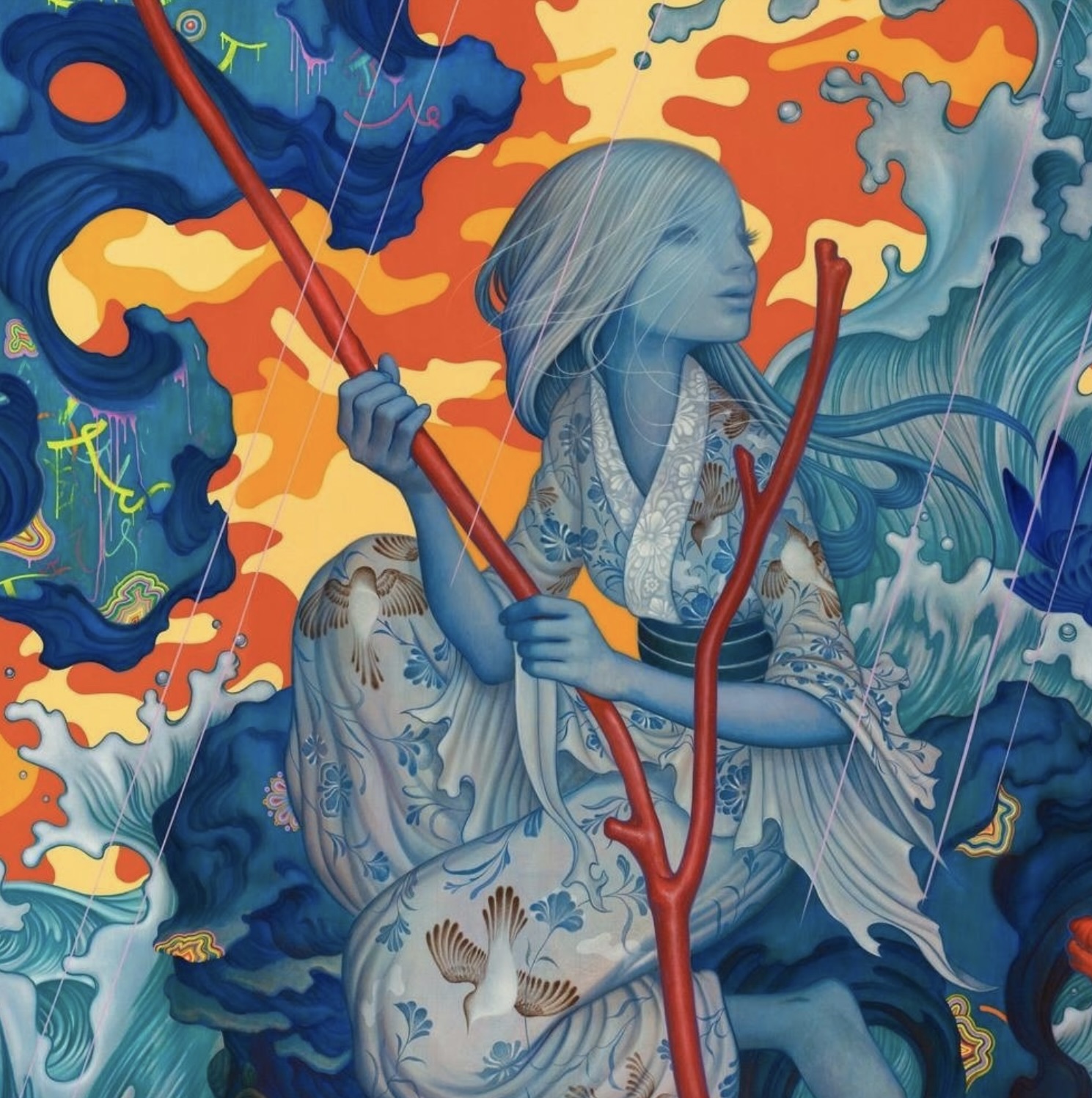
For example, in the movie poster for “Brave,” blue is the dominant color, and the girl’s orange hair serves as the accent color.

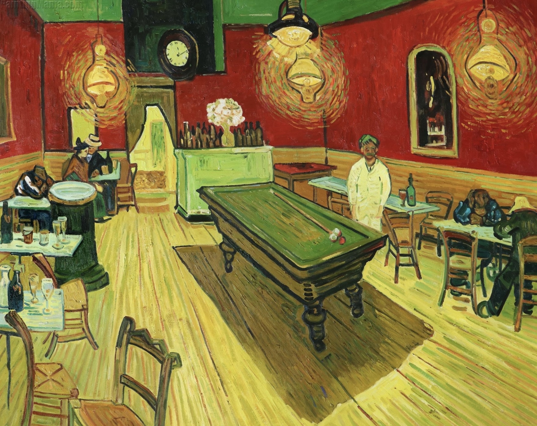
Van Gogh was a master of using the complementary color scheme to evoke human emotions, as seen in his famous painting “Night Cafe.”
In a letter to his brother Theo, he explained his intention behind the painting: “I have tried to express the terrible passions of humanity by means of red and green. The room is blood red and dark yellow with a green billiard table in the middle; there are four citron yellow lamps with a glow of orange and green. Everywhere there is a clash and contrast of the most disparate reds and greens.”
As a result, this painting gives off a jarring and uneasy vibe, precisely the feeling Van Gogh sought to express through this artwork.
2: Tetradic Color Scheme
Within the category of complementary colors, there is a color combination called the tetradic color scheme, also known as the double complementary color scheme. It involves matching two base colors with their complements.

There are several popular tetradic color schemes, such as red, orange, green, and blue; yellow, orange, blue, and purple; vermillion (red-orange), amber (yellow-orange), teal (blue-green), and indigo (blue-purple); and indigo (blue-purple), magenta (red-purple), amber (yellow-orange), and yellow-green.
The tetradic color scheme is the boldest, most vibrant, and also the most challenging color scheme to pull off. However, if executed successfully, it can create a truly unique piece of art.
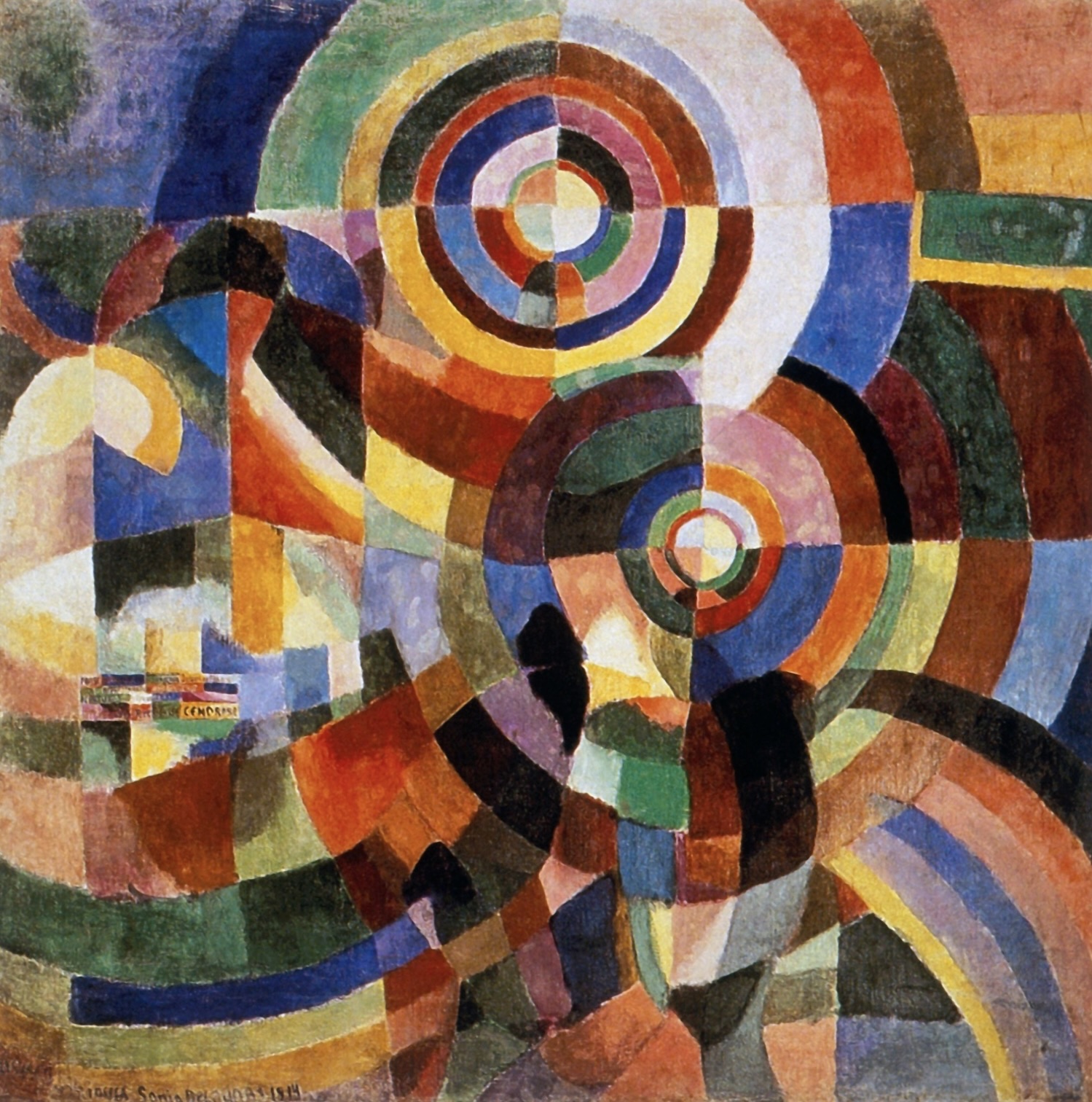
Sonia Delaunay, a Ukrainian-French artist, was a key figure in the Orphism movement, which focused on the harmonious interaction of colors.
She frequently used the tetradic color scheme in her artwork, exploring the interplay of complementary colors. Her painting “Electric Prisms” showcases a vibrant combination of red, yellow, green, and blue, creating a dynamic and visually captivating composition.
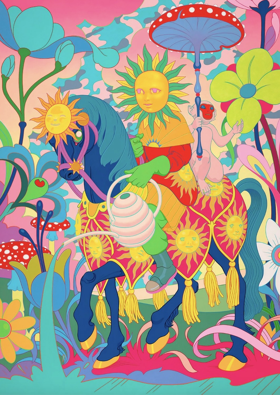
Another prime example is contemporary artist James Jean, he often uses this color scheme to create one-of-a-kind and unforgettable art pieces. To see more of his work, visit http://www.jamesjean.com
3: The Split Complementary Color Scheme
The split complementary color scheme uses the two colors adjacent to the base color’s complement as accents, rather than the direct complementary color.

When used properly, this color scheme can have a more subtle effect than the direct complementary color scheme, creating a harmonious balance between warm and cool tones.
For instance, a painting might prominently feature blue (the primary color) while incorporating orange-red and orange-yellow (the split complements of blue) to craft a vibrant yet harmonious scene.
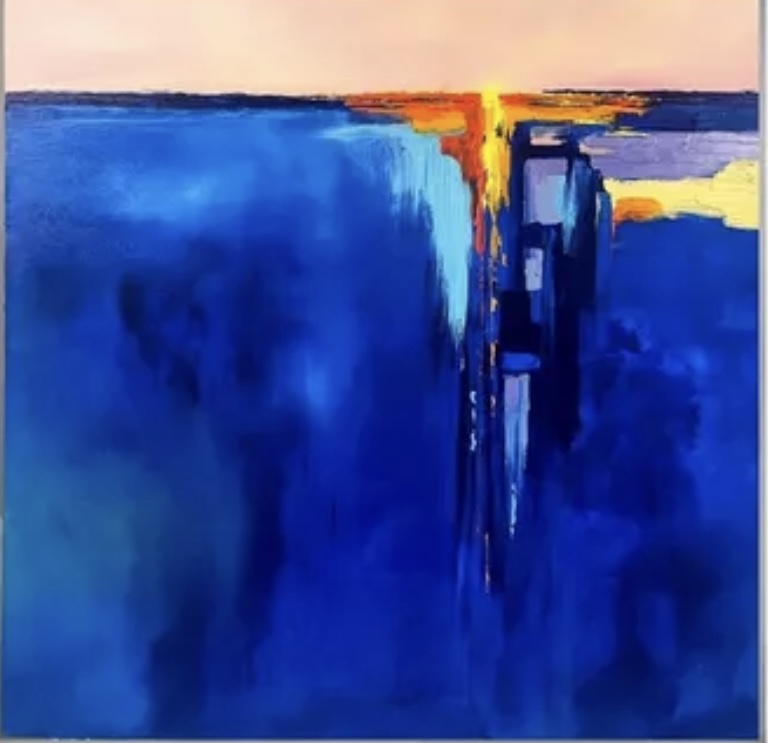
An example of a split complementary color scheme can be seen in my artist friend Liz Doody’s oil and cold wax abstract painting.
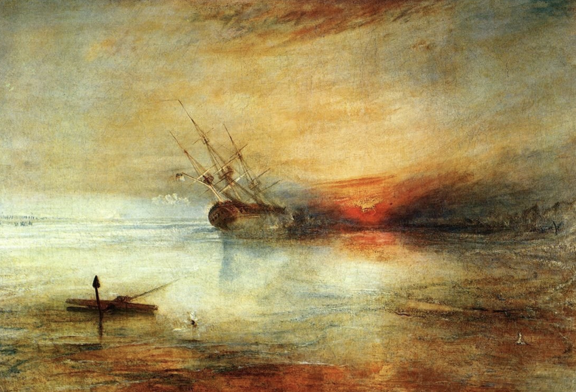
English painter William Turner used a split complementary color scheme to create a harmonious, dream-like atmosphere in his seascape painting.
The key to using the complementary color scheme effectively is to choose a dominant color and use its complementary colors as accents. This ensures that the colors are well-balanced and not overly stimulating.
4: Analogous Color Scheme
An analogous color scheme typically consists of three colors that are adjacent to each other on the color wheel. It includes a dominant color, a supporting color, and an accent color. Additional colors can also be used as long as they are close to each other on the color wheel. Additionally, black, white, and grey can also be incorporated into these colors.
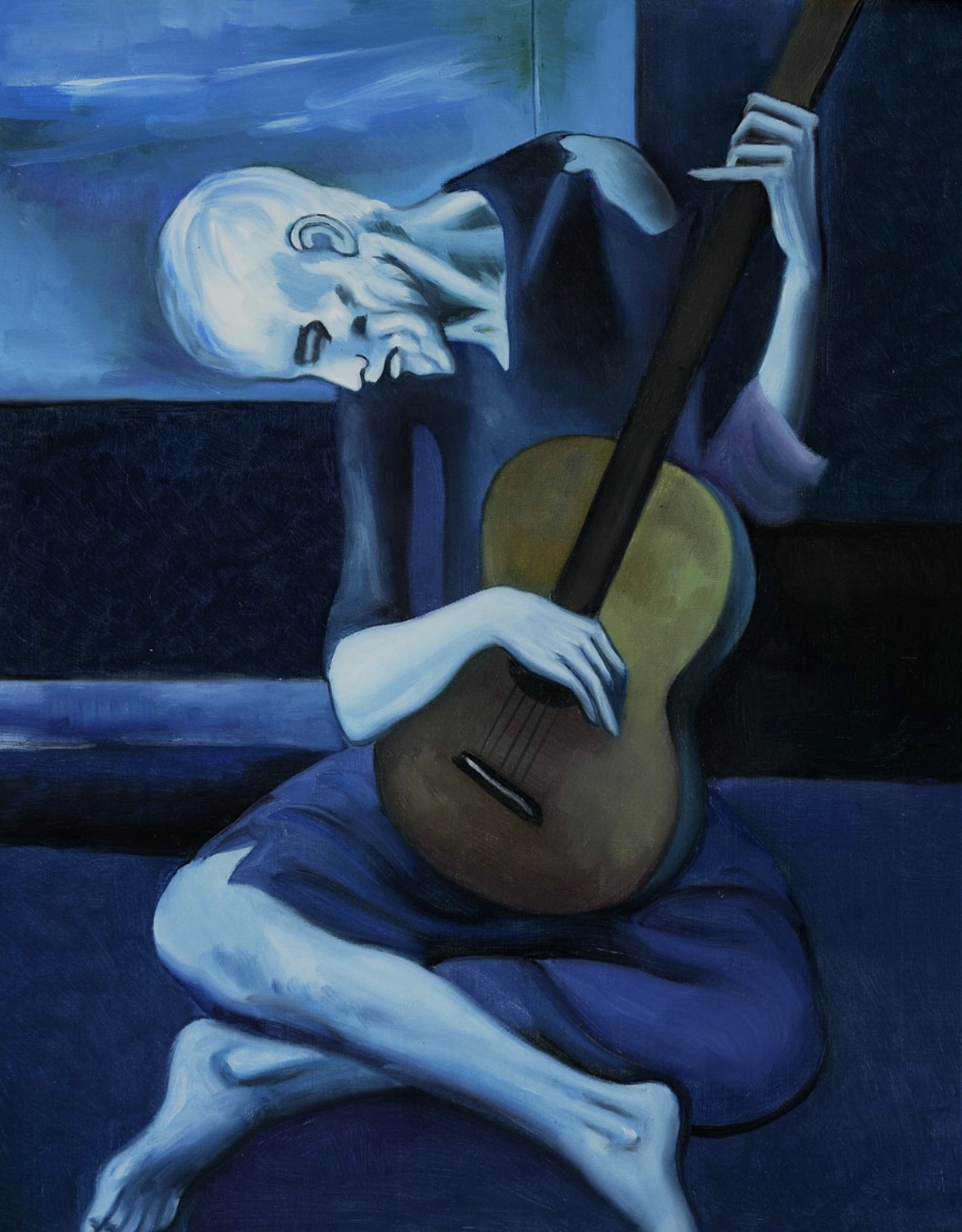
Interesting art history–Pablo Picasso had a time between 1901 and 1904 when he painted in monochrome blues and greens.
Talking about using color’s psychological effect– He was living in Paris, far from his family and home, in extreme poverty. This blue period was triggered by the death of his closest friend, Carles Casagemas, whose “infatuation with a girl and her rejection led to his subsequent attempt to kill her and to his own suicide. Picasso later explained, “It was thinking about Casagemas that got me started painting in blue”(Picasso and the, 2013).
Picasso intentionally painted in monochrome tones of blue that reflected his psychological state. His blue paintings portray destitute human beings. He chose the color blue to express misery and despair — “to intensify the hopelessness of the figures depicted, such as beggars, prostitutes, the blind, out-of-work actors and circus folk, as well as Picasso himself and his penniless friends. At the time, Picasso even wore blue clothes”(Picasso and the, 2013).
5: Monochromatic Color Scheme
A monochromatic color scheme revolves around a single color that serves as the basis for all shades and hues within a painting. The shade of color varies in value and saturation. Sometimes, black and white are used as the two ends of the spectrum.
Example:
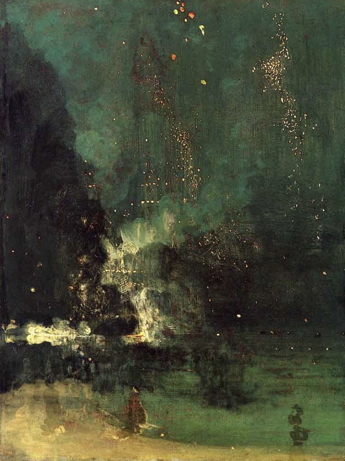
James Abbott McNeill Whistler – “Nocturne in Black and Gold – The Falling Rocket”: Whistler’s painting is a prime example of a monochromatic color scheme. The artwork predominantly features various shades of black and gold, creating a nocturnal and atmospheric scene.
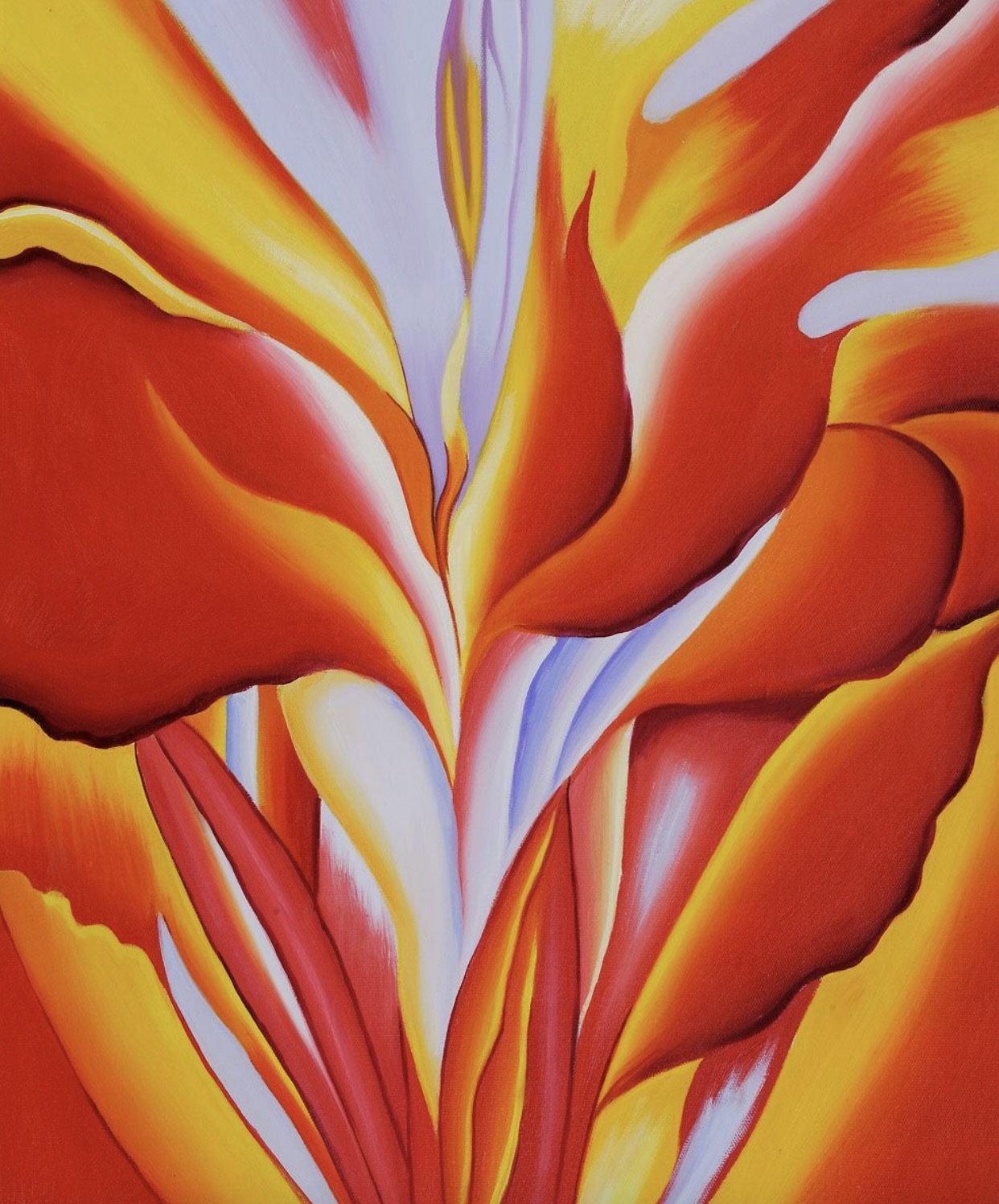
In this painting, Georgia O’Keeffe used monochrome red to paint this flower’s inside details.
With the exception of the monochromatic color scheme, when applying these principles,
remember to be careful not to use all the colors with the same strength and emphasis. Otherwise, it may create a jarring and uneasy feeling due to an overwhelming presence of colors jumping out of the painting simultaneously. –Achieving a delicate balance is crucial.
In my next post, we will delve deep into the science of color to understand why different color combinations have varied effects on human perception. So, keep an eye out for it! Also, to read more about the famous impressionist colors, click this link: https://yingmclane.com/color-series-9-the-impressionists/#4
I hope this post proves helpful. If you like it, feel free to share it with a friend. Happy painting and exploring!