One distinct characteristic of oil paints is their inherent properties of density. There are basically three kinds of oil paint densities: opaque, transparent and translucent. Knowing these difference is important in oil painting process. In this post we are going to explore the topics below:
1. Opaque Color
Just like the name suggests, opaque oil colors are thick and dense. This is because the pigments usually contain clays, iron, or heavy metals, resulting in great covering strength. Opaque colors are often used in direct painting methods, or as the final layer of a painting.
Commonly used opaque colors are:
- All Cadmium colors
- Yellow Ochre
- Naples Yellow
- Titanium White

2. Transparent Color
Transparent colors are a subset of paint pigments that, as the name suggests, allow light to pass through them. When applied in thin layers, they maintain their transparency, which is a valuable characteristic for artists. They typically come from colored liquids mixed with chalk or other substances to give body to the paint.
When brushed in a thin layer on a surface, you will see the colors are clear and show through the color underneath it. These colors are invaluable for creating subtle shifts in color, depth, and luminosity in a painting.
Typical transparent colors are:
- Quinacridone Red (also called Rose Red, Halo Red, or Permanent Rose)
- Ultramarine Blue
- Cerulean Blue
- Transparent Oxide Brown
Check this link for a detailed post about transparent color: https://yingmclane.com/how-transparent-colors-elevate-your-painting/
3. Translucent Color
Neither totally opaque nor totally transparent, translucent colors are in between. When brushed in a thin layer, a translucent color will appear cloudy. They work well when applied over another color, allowing the lower layer to show slightly through, creating an interesting layered effect.
Typical translucent colors are:
- Zinc White
- Green Earth colors
4. Tinting strength
Tinting strength means the ability of a color can affect other colors when mixed together.
When use colors with high tinting strength, like when you use Cadmuim Red to mix with skin tone and add warmth to it, you only need to use a very tiny amount of it or it will over powering the mixture.
Colors with low tinting strength, on the other hand, is very easily overwhelmed by other colors when you mix them together. Naples Yellow is a typical low tinting strength color.
5: Simple Exercises
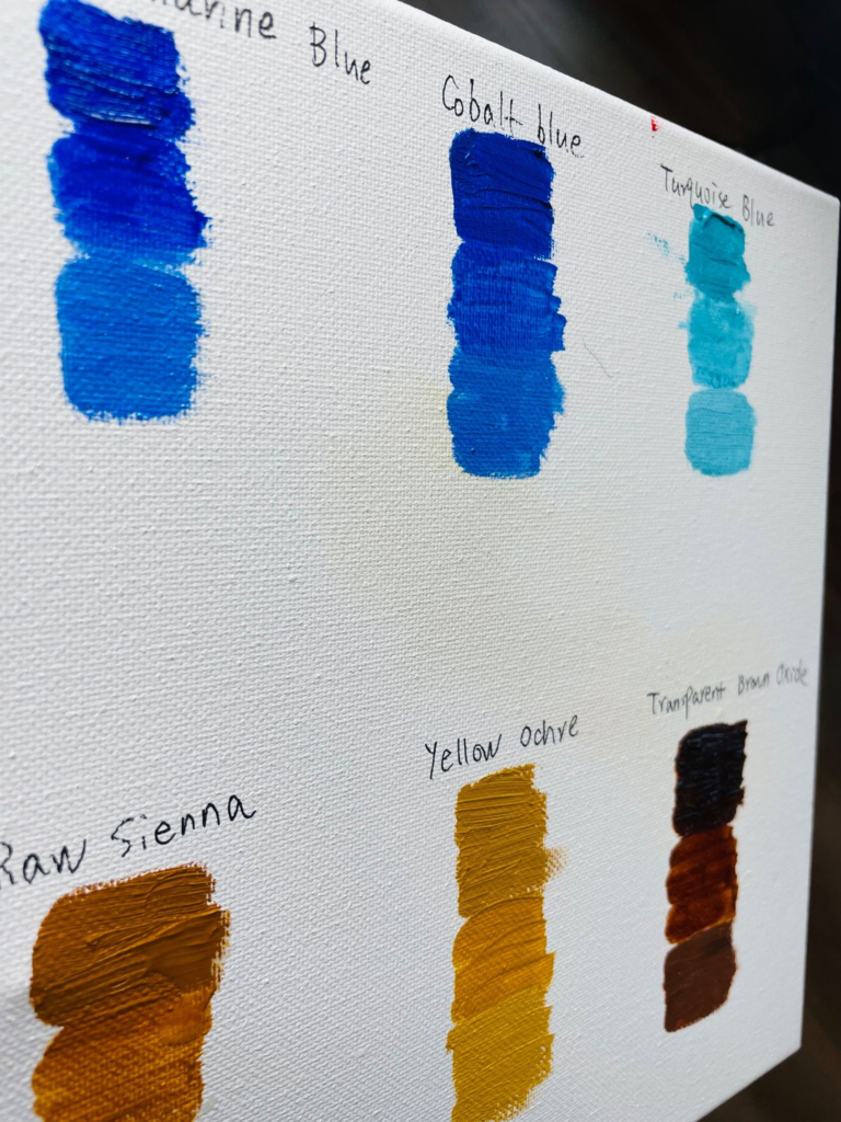
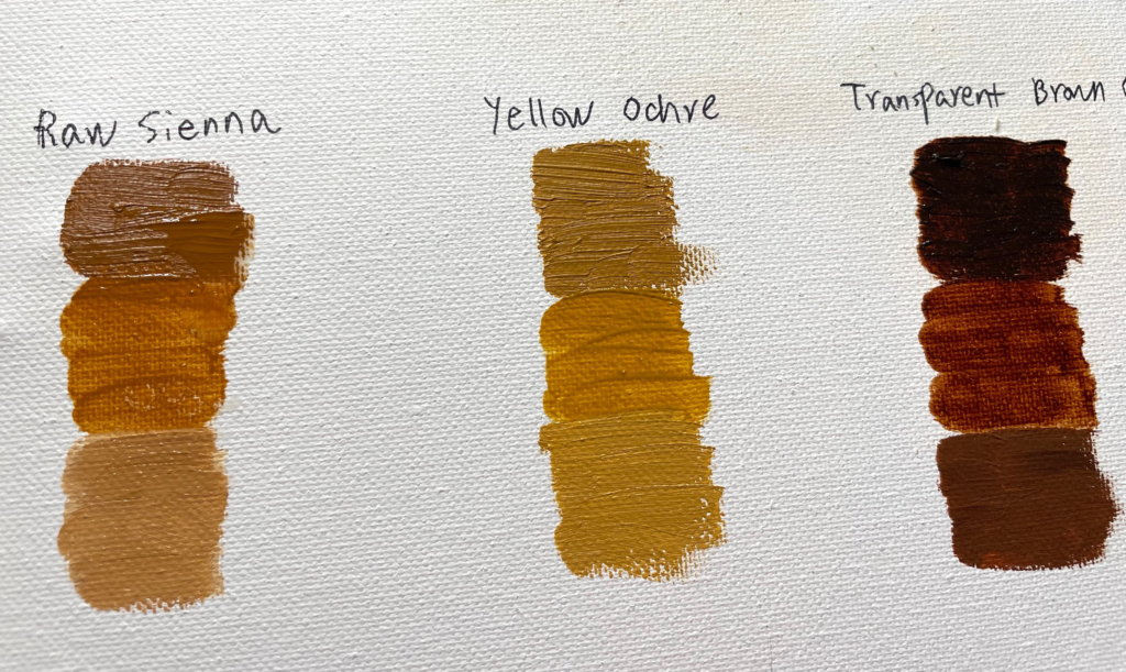
Doing a simple color density test, or tint test, is a good way to identify and get familiar with colors. Grab a canvas or canvas pad, lay out the color you’d like to test, organizing them by groups like reds, yellows, blues.
Now, put down a brush width of the color directly from the tube. Next, use a little linseed oil to mix with each of the samples and make a brush width of color under the original color. This is for testing the transparency of each color. Lastly, mix the original color with a little Titanium White, to test the tint of each color.
Now for each color, you will have three squares of color variation to test. Compare each variation and see the transparency and tint of each color.
Since the colors straight from the tube could be deceptive to the eyes or they may appear the same in a color group. By making these tests, you can see the color’s true identity and have a better understanding of each color’s property.


Hope this post is helpful. Leave a comment or share with a friend!


Fantastic