An artist friend of mine recently reached out to me with some confusion about the differences between hue, saturation, and value. Given that we’re exploring color theory, I thought it would be a great opportunity to clarify these three critical aspects of color and discuss how they contribute to achieving harmony in art.
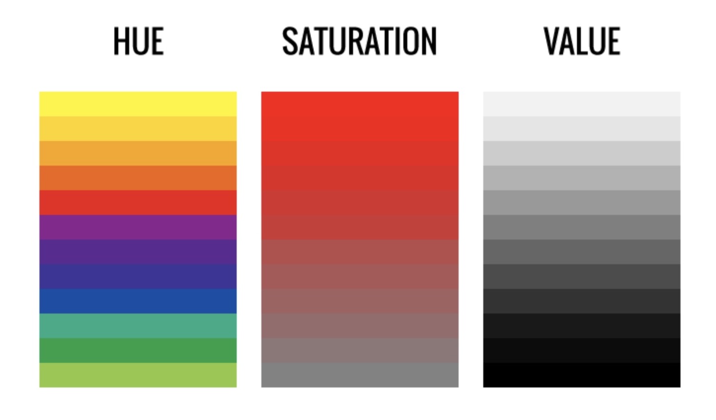
1. Hue
Simply put, hue refers to the name we give to colors, such as yellow, red, blue, turquoise, magenta, and so on.
Hue describes color families, rather than specific shades. like red, not magenta or scarlet.
Each hue has a wide range of colors within it thanks to variations of values and chromas.
2. Saturation (Also Known as Chroma)
Saturation, or chroma, indicates the intensity or purity of a color. It denotes how much gray is mixed with the hue.
In the color wheel example below, you can see the saturation increases as you move toward the outer edge and decreases toward the center. Thus, a color becomes duller as more gray is mixed in, and conversely, a color appears more intense the purer it is.
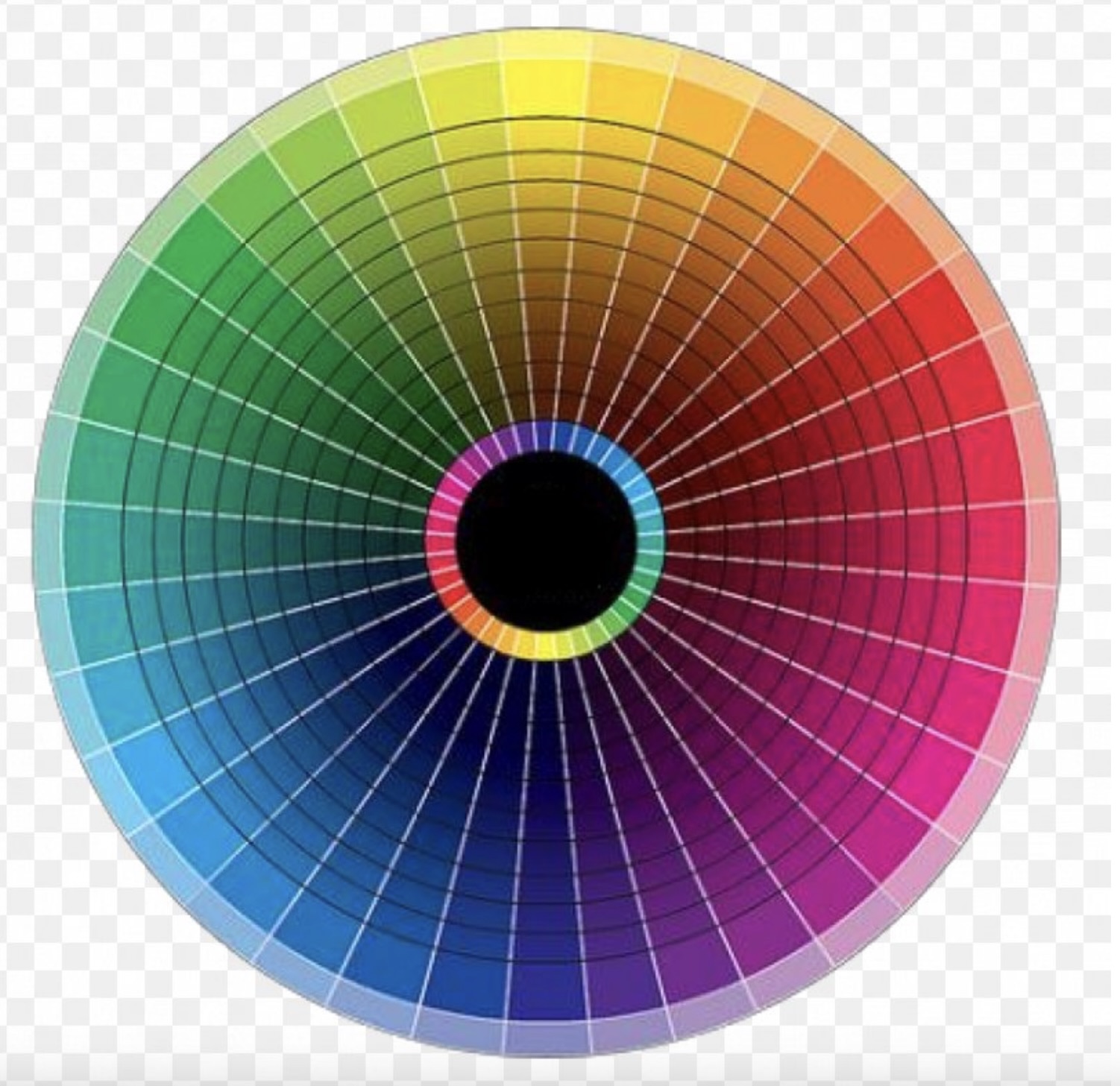
Painting Tip: To achieve a duller, earthier color, you can either add gray or black to a color or introduce the complementary color, which is located on the opposite side of the color wheel.
3. Value
Value refers to the lightness or darkness of a color.
On a color wheel, adding white increases a color’s value, making it lighter, while adding black decreases its value, making it darker.
Value is a crucial concept in art, arguably even more important for beginners than color itself. Many contemporary artists alter the color of their subjects, such as in portraits, to create an interesting artistic style. As long as the values are accurate, the subject remains recognizable, contributing to a compelling piece of art.
4. Color Harmony
Now that you have a basic understanding of hue, saturation, and value, you’re equipped to create color harmony in your paintings, enhancing their aesthetic appeal and visual interest.
Here are some basic color schemes:
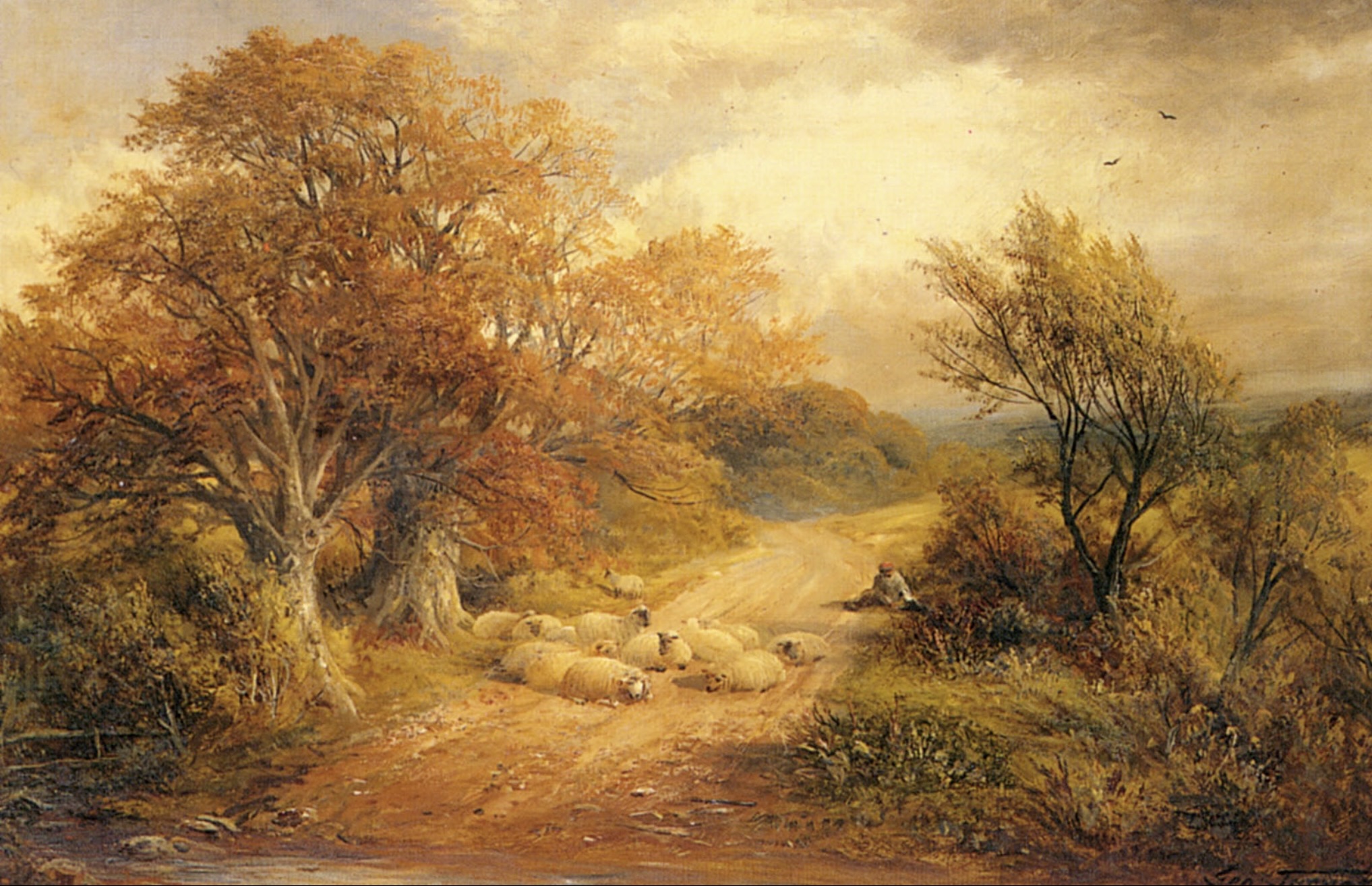
Analogous: Utilizes colors next to each other on the color wheel, sharing similar hues (e.g., blue, blue-purple, purple). Landscape painters often employ this scheme for its ability to evoke peace and calm.
19th-century English painter George Turner’s paintings used analogous earth colors to describe the romantic landscapes of the English countryside.
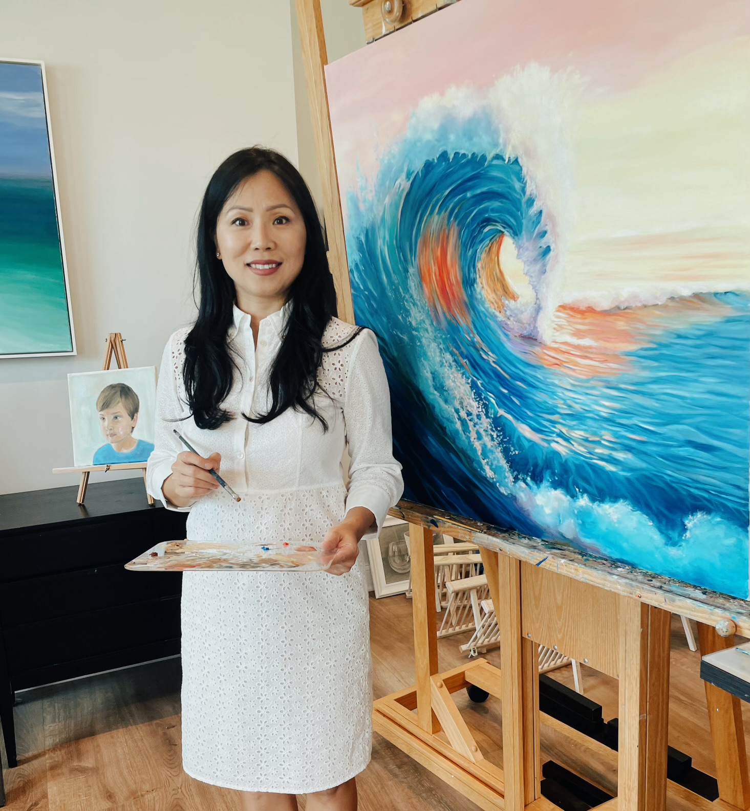
Complementary: Involves colors opposite each other on the color wheel to create drama and contrast (e.g., red vs. green, yellow vs. purple, blue vs. orange). This is currently my favorite scheme because it can quickly capture attention and generate strong visual interest. I used a complementary color scheme of orange and blue to paint this wave painting.
Split Complementary: This scheme uses a color plus the two colors adjacent to its complementary color (e.g., blue, yellow-orange, and red-orange).
Paul Gauguin: “Vision After the Sermon”
Gauguin’s “Vision After the Sermon” exemplifies the split complementary color scheme. The painting contrasts reds with greens and a yellowish-green, offering a vibrant visual experience while maintaining a balance that is less intense than a direct complementary scheme.
This approach allows Gauguin to explore bold color contrasts that still achieve harmony and depth.

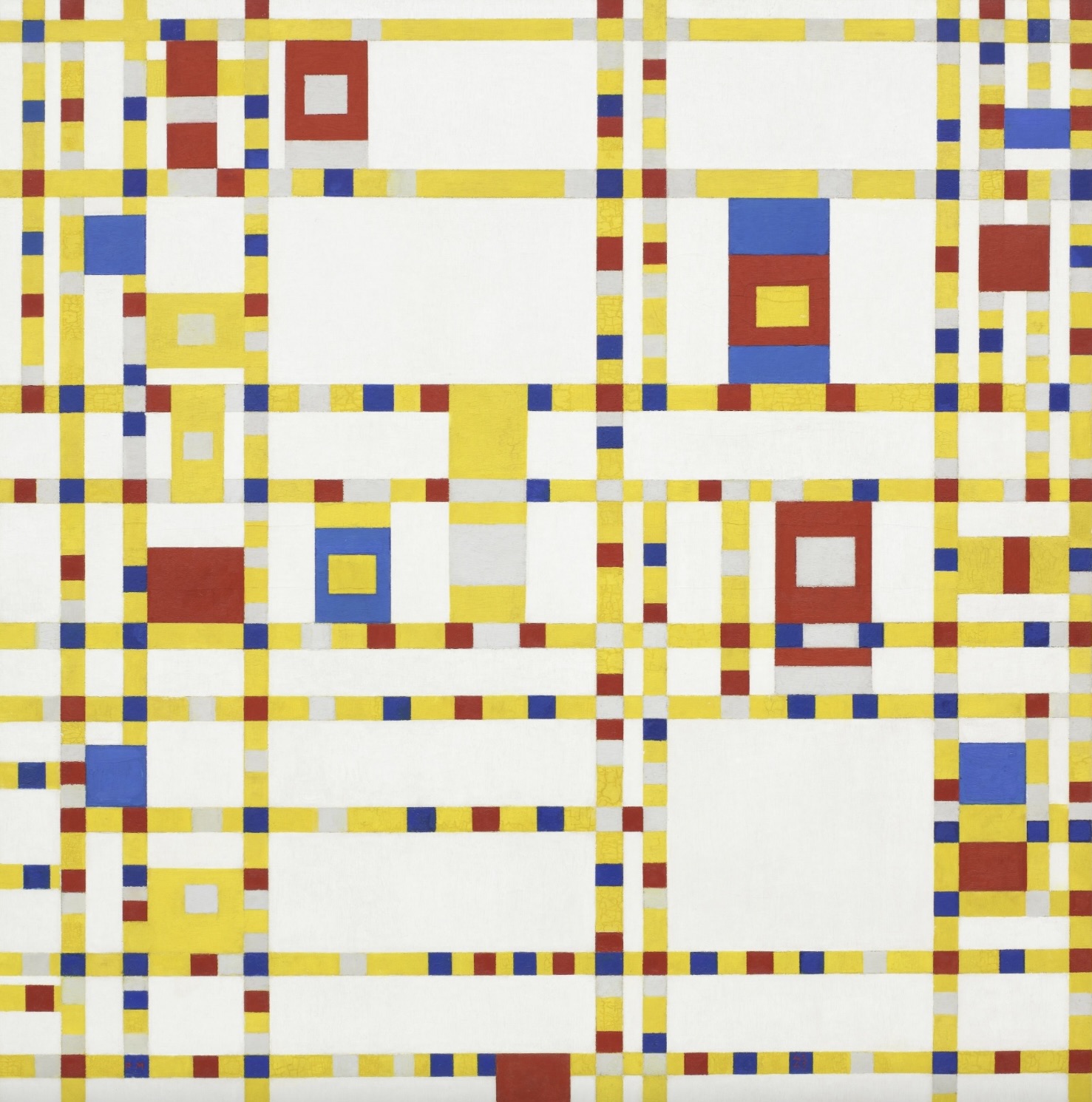
Triadic: Features colors that are equally spaced around the color wheel, such as red, yellow, and blue.
Piet Mondrian:“Broadway Boogie Woogie”
Mondrian’s “Broadway Boogie Woogie” perfectly illustrates a triadic color scheme, utilizing primary colors: red, yellow, and blue. This painting, inspired by the bustling streets of New York and jazz music, features a grid of white, black, and gray lines with blocks of the three primary colors. The triadic scheme creates a vibrant, rhythmic composition that mirrors the energy of the city and its music.
I hope this post has helped you grasp the basics of color theory. Feel free to ask any questions you may have!
Very informative; this topic on color has always been the most difficult for me to grasp. Great overview.
Thank you for your comment, Dale! Glad you found this post helpful!
Pingback: Color series 9 - The Impressionists: - Ying McLane