We have discussed complementary, analogous, and monochromatic color schemes in our previous posts. But why do these different color combinations have such a significant effect on our perception of colors?
1: What is Simultaneous Contrast?
2: A Brief and Interesting History
1: What is Simultaneous Contrast?
It all comes down to an important scientific phenomenon: simultaneous contrast.
Simultaneous contrast refers to the way in which two colors affect each other.
When a different color is placed next to a color, it can change how we perceive the tone and hue of that color, even though it’s the exact same color.
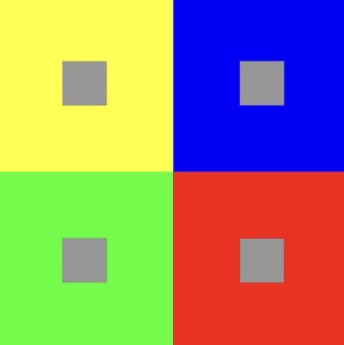
For example, when you place a gray rectangle inside different color shapes, the gray will take on a tint of the complementary color of the surrounding color.
Did you notice that the first gray within the yellow rectangle had a purple tint, while the gray within the green rectangle had a reddish tint? It’s quite fascinating, isn’t it?
The science behind it is that the human eye simultaneously demands the complementarity of a particular color it sees. As an example, when you look at a blue object for a while and then close your eyes, you will see the complementary color of blue, which is orange, in your mind’s eye.
2: A Brief and Interesting History
Simultaneous contrast was first described in the 19th century by Chevreul in his famous book on color theory, “The Principles of Harmony and Contrast of Colors,” published in 1839 (translated into English in 1854).
While working in a carpet-making factory, Chevreul discovered that the reason people complained about the carpet dye appearing “dull” was not due to the dye itself, but rather how the colors were arranged next to each other. This led him to conduct thorough research and publish his book.
In the book, Chevreul systematically studied color and color perception, demonstrating how our brains perceive color and value. He discovered that when two colors are placed close together in proximity, each color can take on the hue of the complement of the adjacent color. For example, if a dark red and a light yellow are seen side by side, the red will appear shifted toward violet, while the yellow will appear shifted toward green. Additionally, dull or near-neutral colors can make saturated colors appear more intense.
3. Examples:
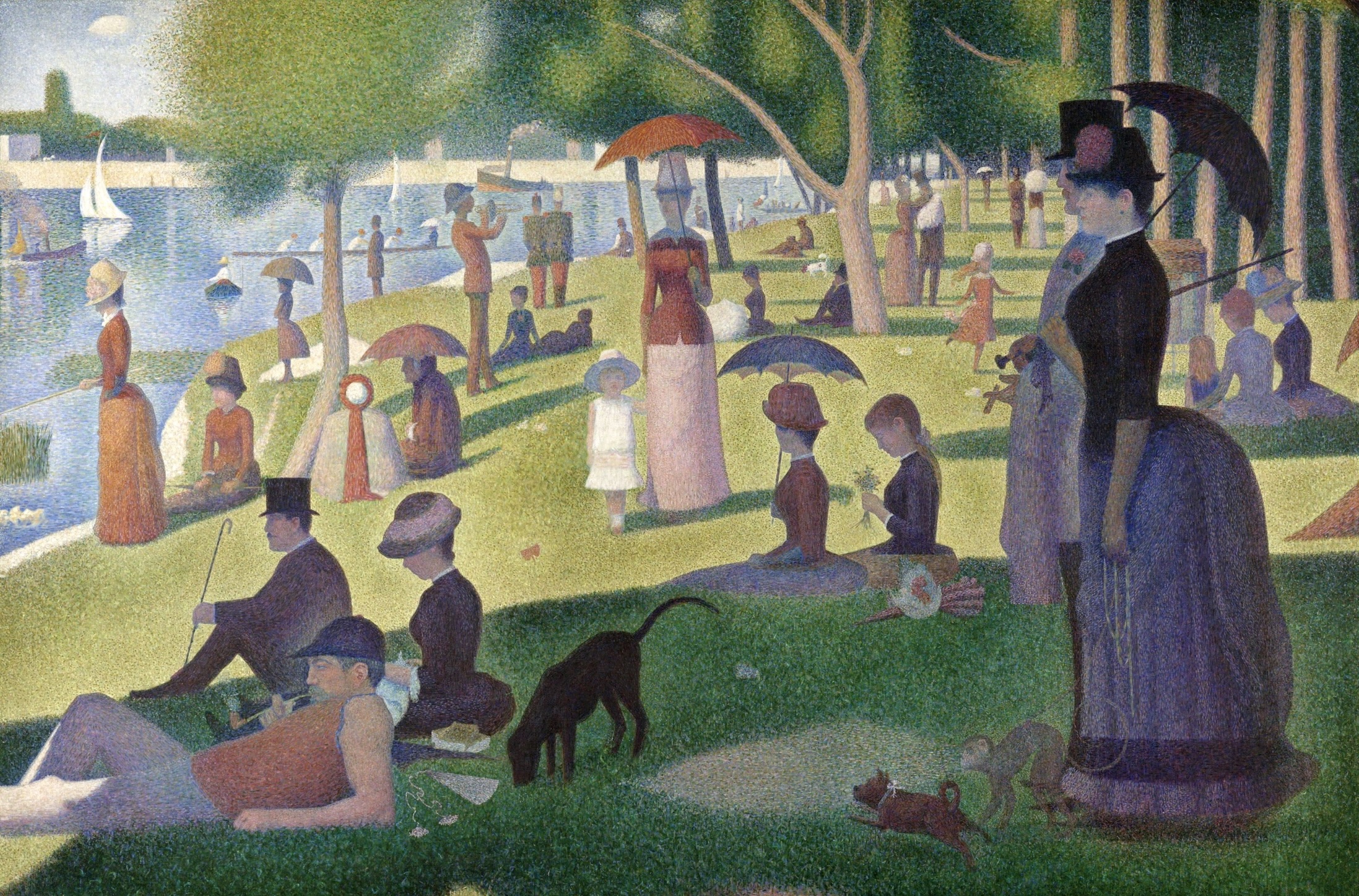
Georges Seurat – “A Sunday on La Grande Jatte”: Seurat’s famous pointillist painting is a prime example of simultaneous contrast. By applying small dots of contrasting colors next to each other, Seurat achieved the optical mixing of colors in the viewer’s eye, creating vibrant and luminous effects.
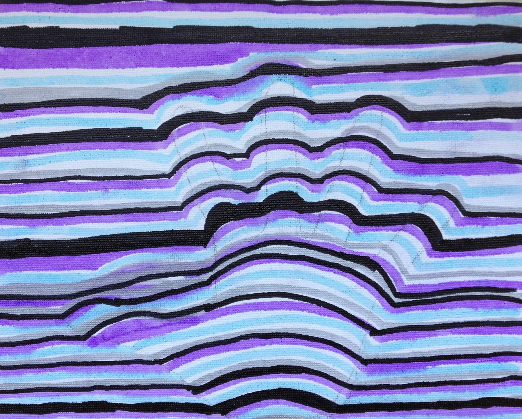
Bridget Riley – Op Art: Riley’s optical art relies heavily on the use of simultaneous contrast. Her geometric patterns and repetitive shapes in contrasting colors create optical illusions, producing a sense of movement and depth that captivates the viewer.
4. Color Tips:
- Dark colors next to bright colors make the bright color appear even brighter and the dark color appears darker.
- Warmer colors look warmer when placed next to cooler colors.
- Cooler colors look cooler when placed next to warmer ones.
- A bright color next to a muted color makes the muted color appear more dull, and vice versa.
- If two colors have similar brightness, they will appear less bright when placed next to each other.
In addition to the above tips, when painting, it is helpful to start with a thin wash of colors and gradually build up layers. This allows you to view and judge the colors as they are applied together. I avoid finishing a small area of a painting first, as I never know how the color will appear next to other colors once the painting is complete.
I hope you find these insights on simultaneous contrast and color contrast in art helpful in your artistic endeavors!